A perfect getaway hotel. Far from the noise of the concrete jungle.

%20(2)%20(online-video-cutter.com)%20(1)%20(2)%20(2).gif)
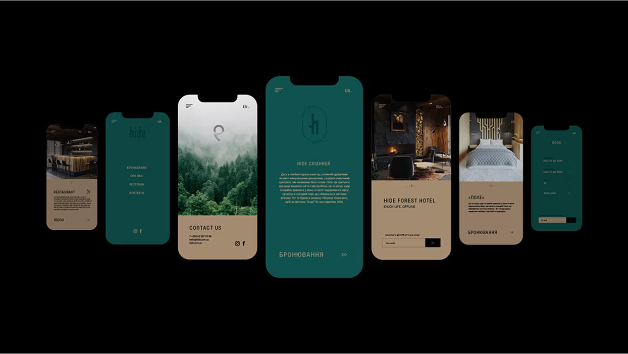
Nestled in the tranquil forests of Skhidnitsa, Ukraine, Hide Hotel aimed to become more than just a place to stay — it needed to embody a retreat from the chaos of everyday life. The challenge was to develop a brand that captured the emotional essence of seclusion, serenity, and nature. Additionally, the hotel required a careful architectural transformation that would allow for expansion while preserving the charm and intimacy of a small mountain hideaway.
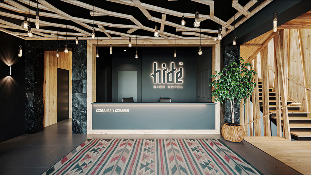
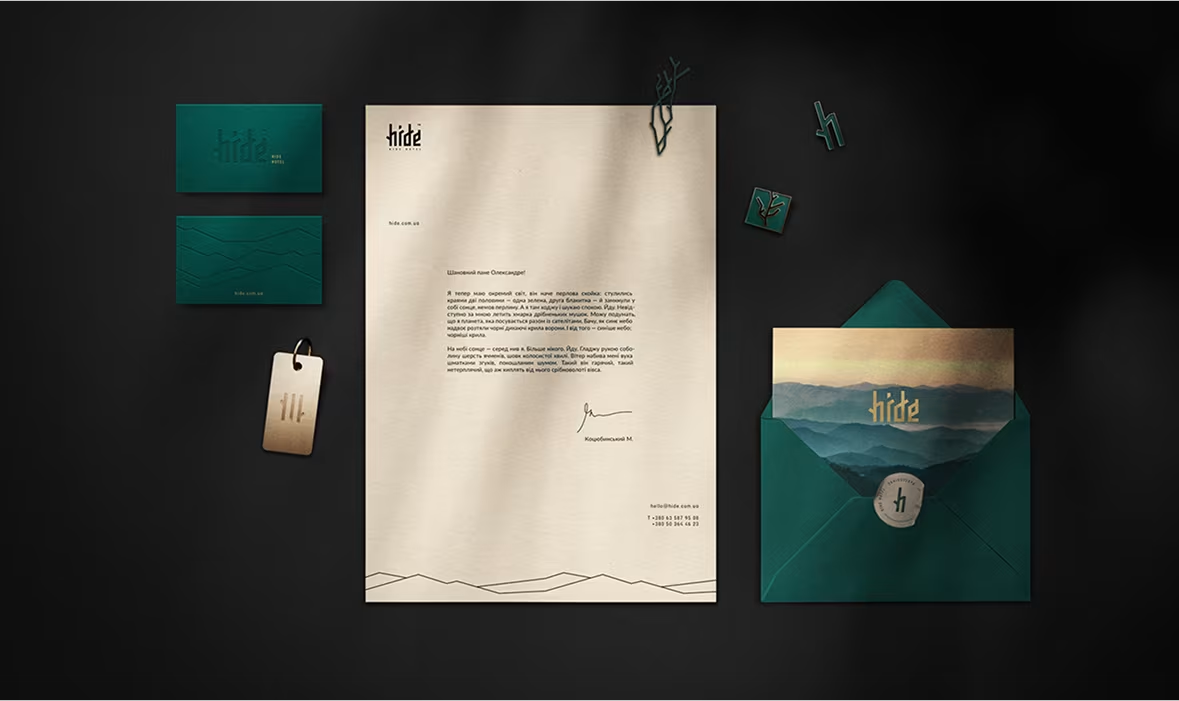
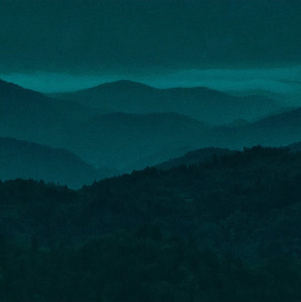
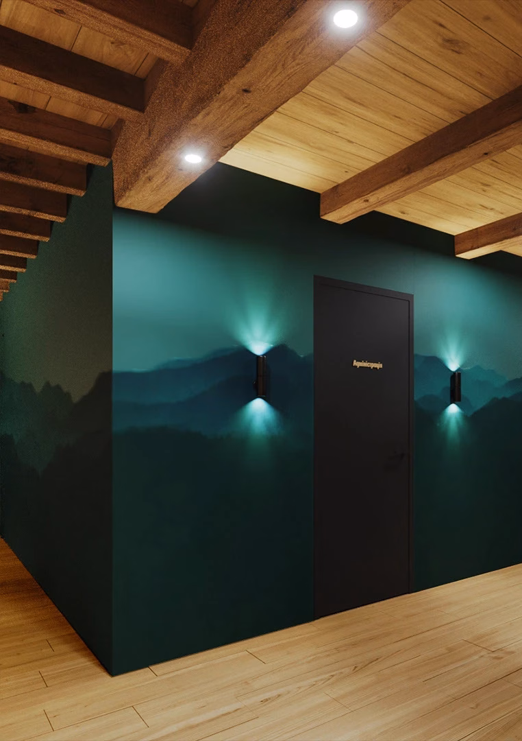
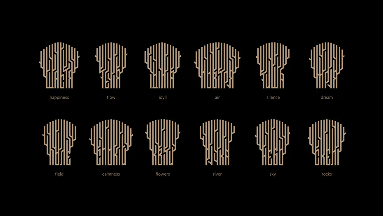
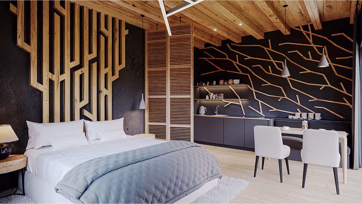
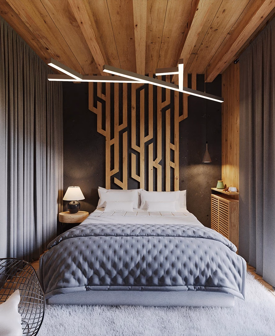
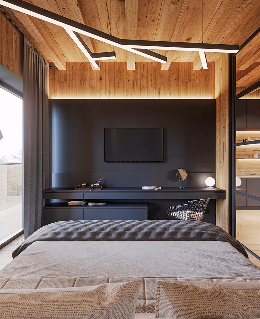
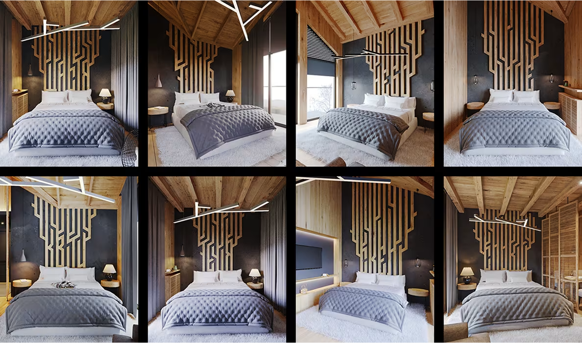
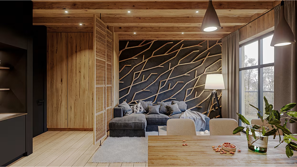
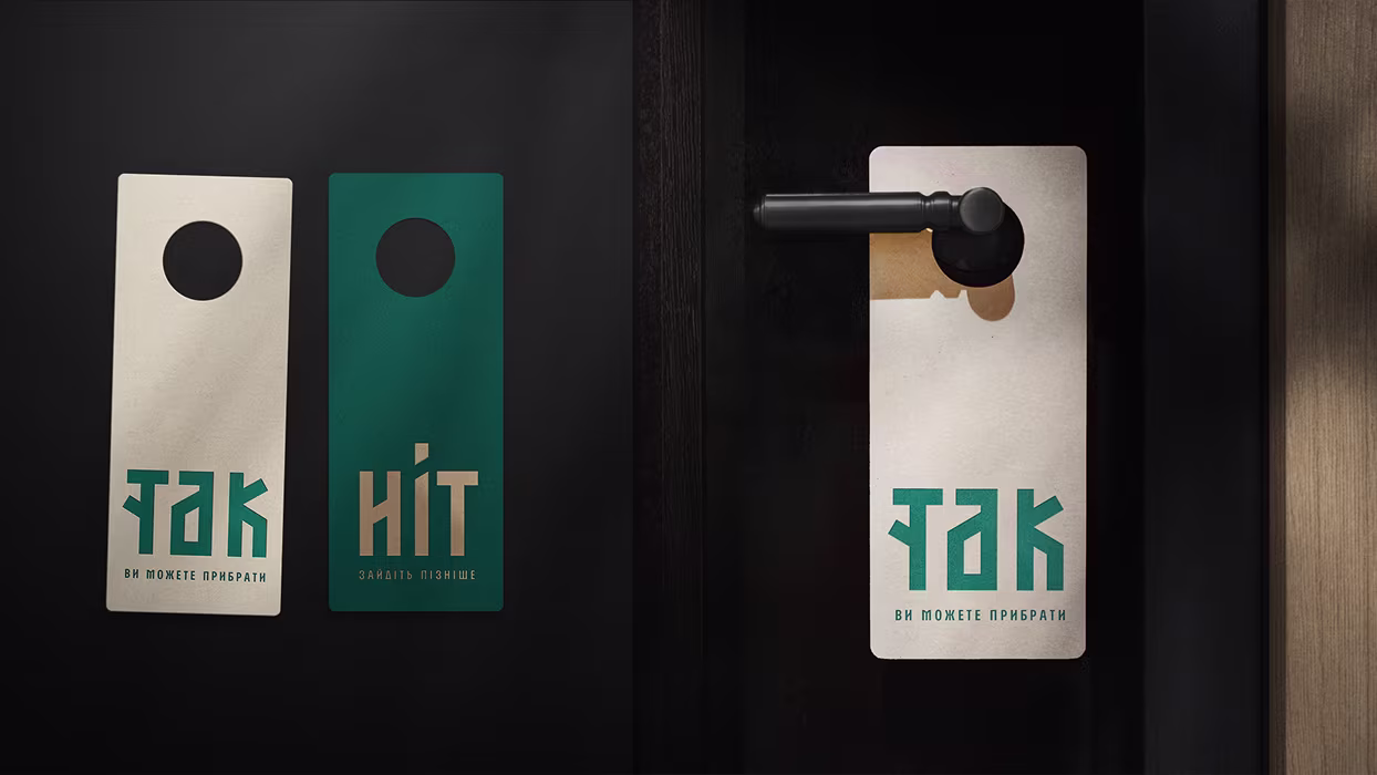
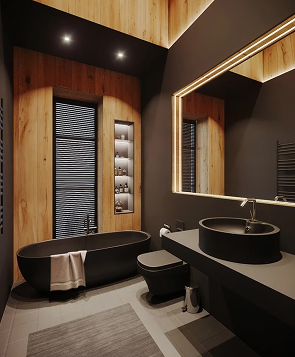
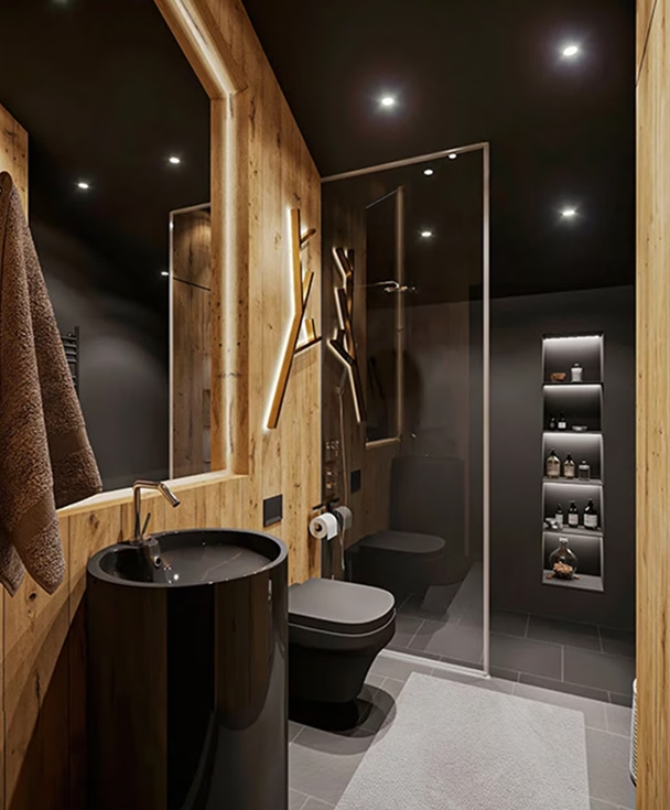
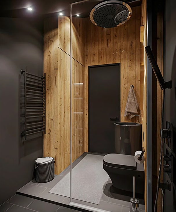
Through Brandon Archibald’s "Hotel Identity™" approach, we crafted a holistic brand experience — from naming and visual identity to architectural details. Inspired by the surrounding nature, the logo, colors, and materials reflect the forest, mountains, and the contrast of day and night. Unique room names like "Silence" and "Happiness" set the tone for a restorative stay, while custom headboards added a personal, artistic touch.
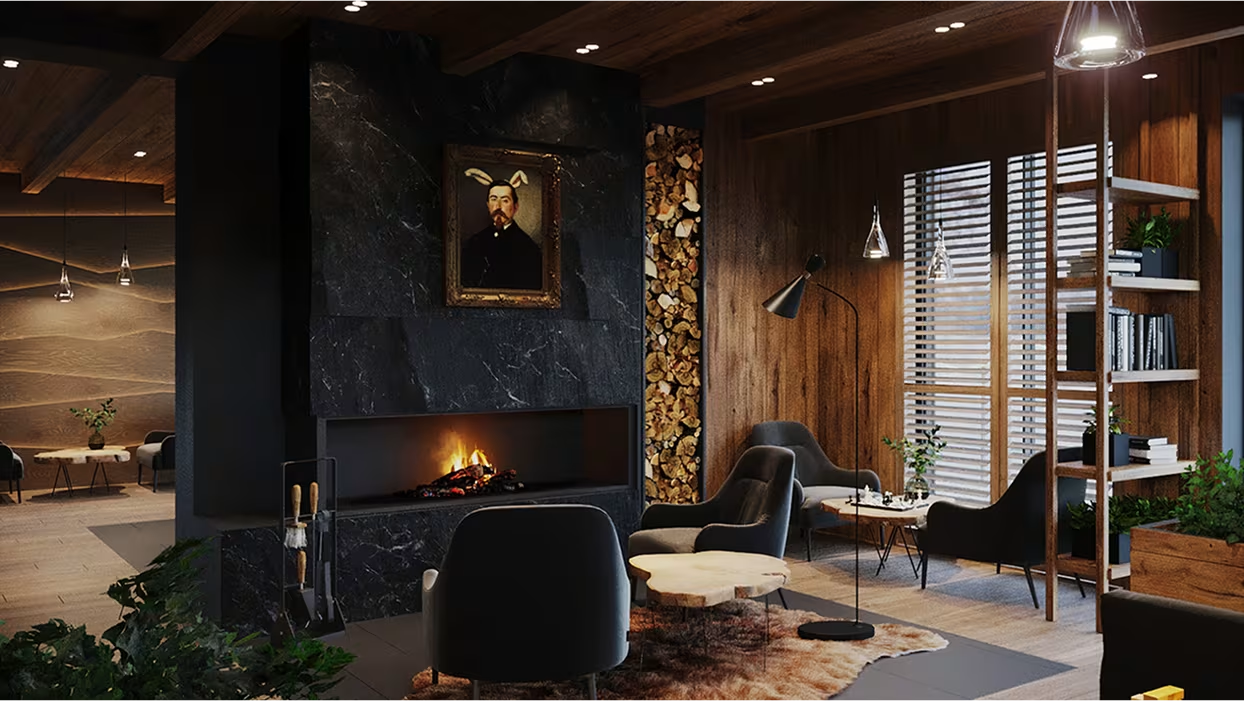
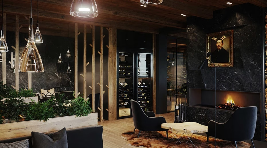
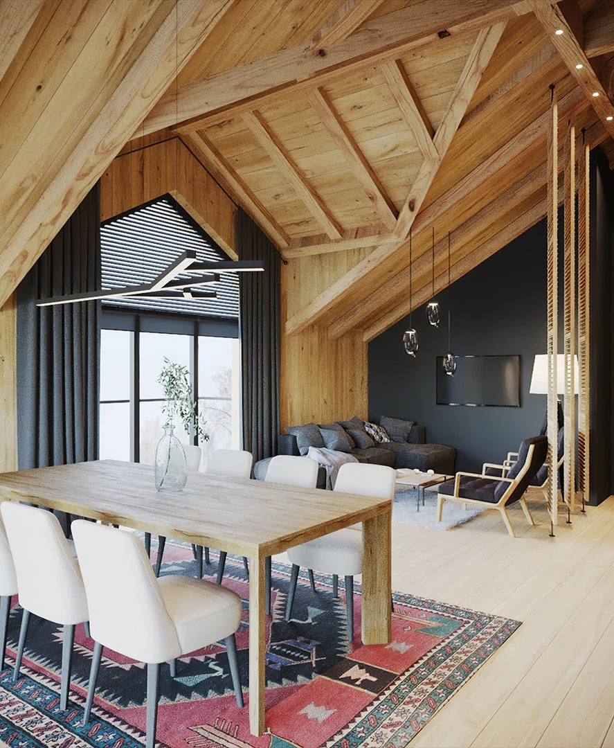
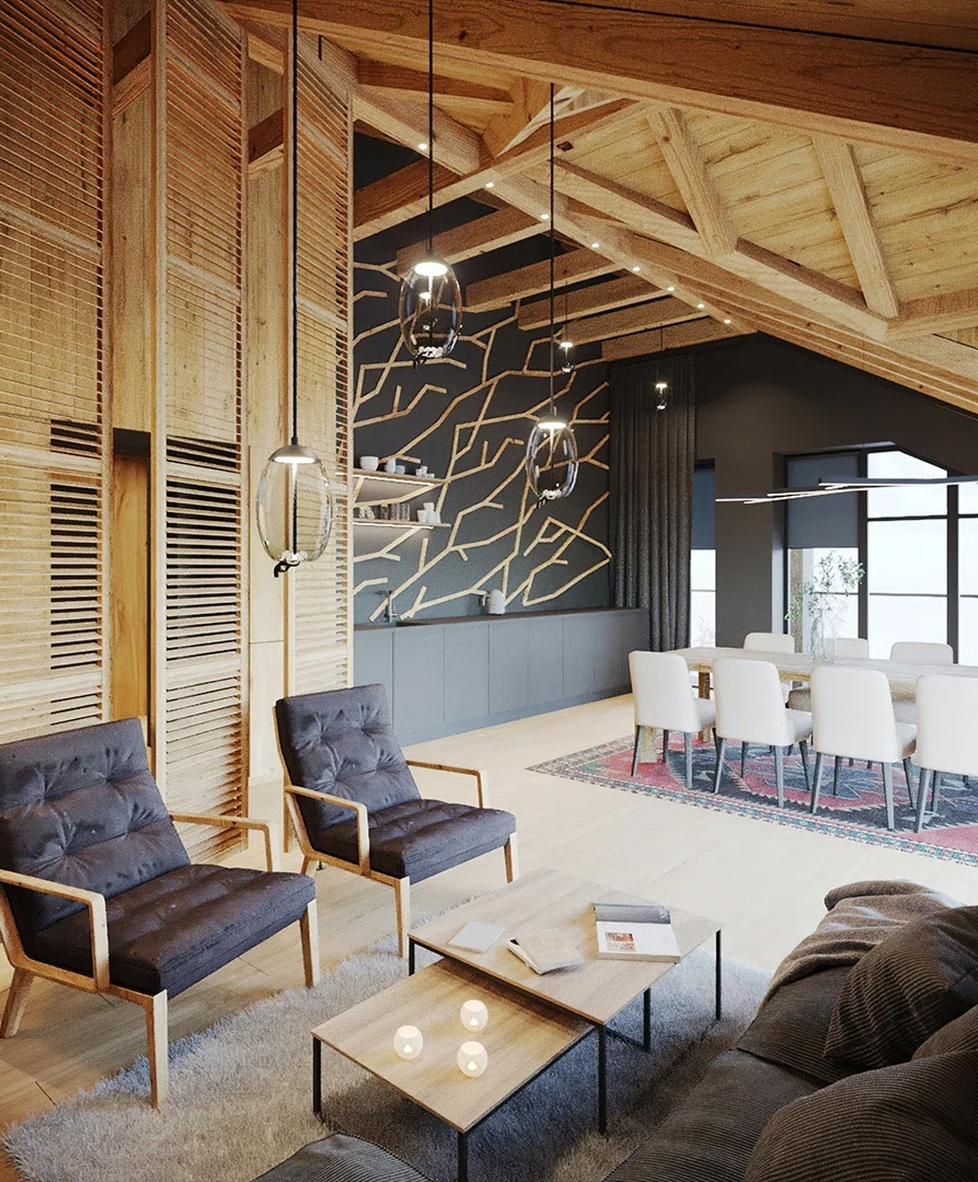
The reconstruction carefully blended old and new elements, expanding capacity without sacrificing the hotel’s soul — resulting in a space that feels hidden, harmonious, and deeply human.
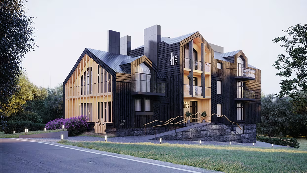
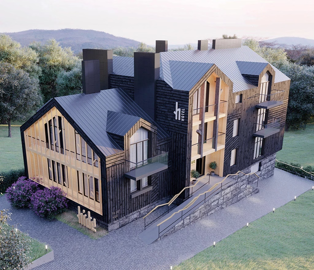
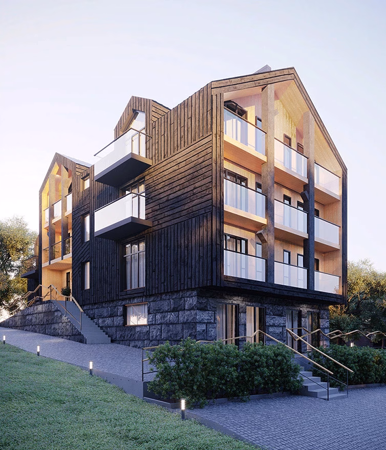
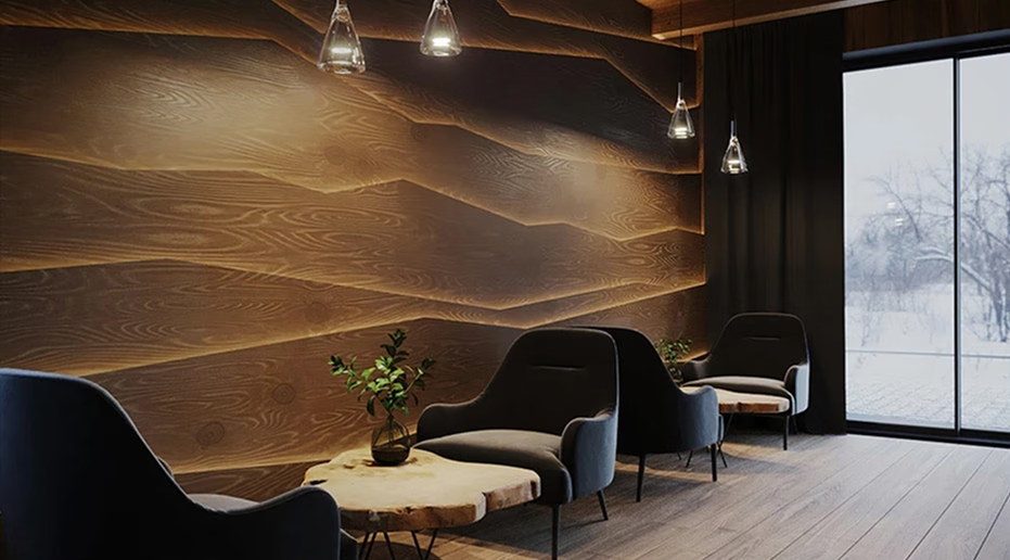
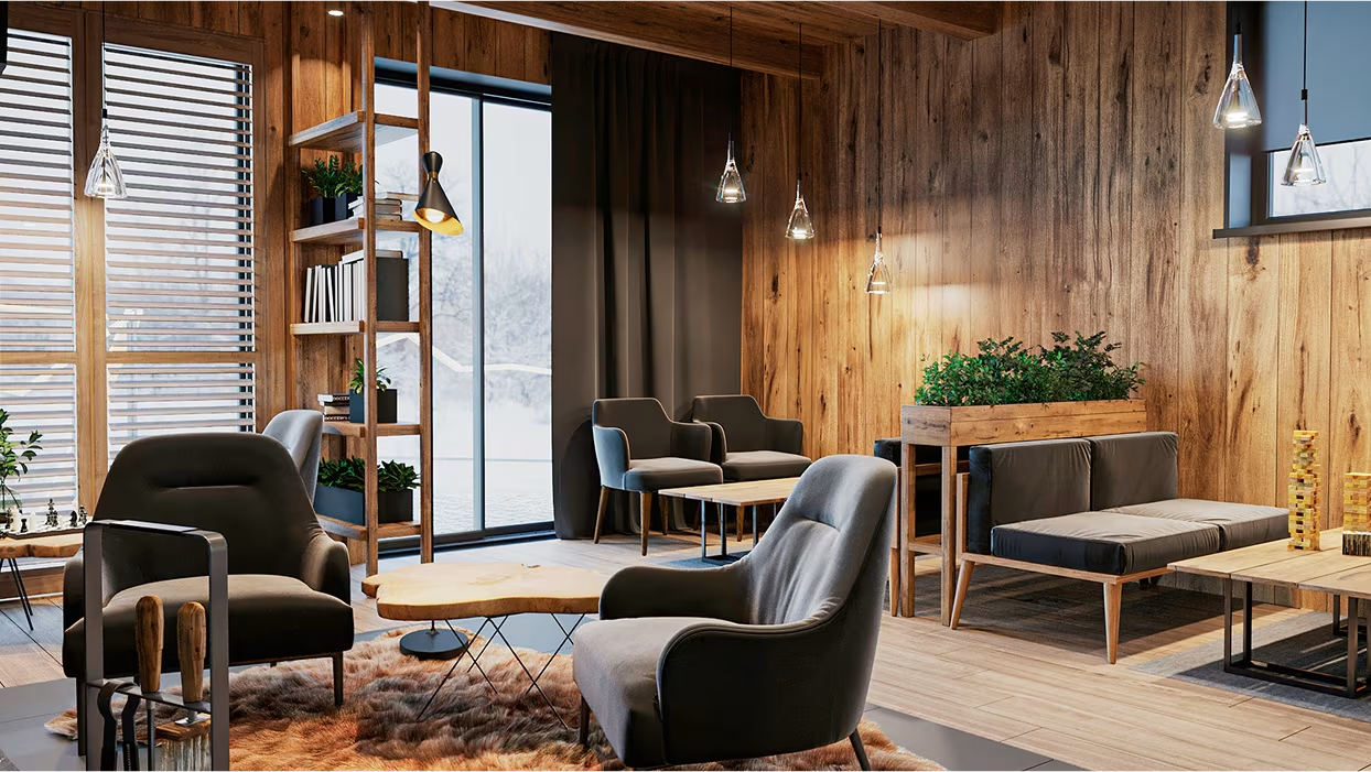
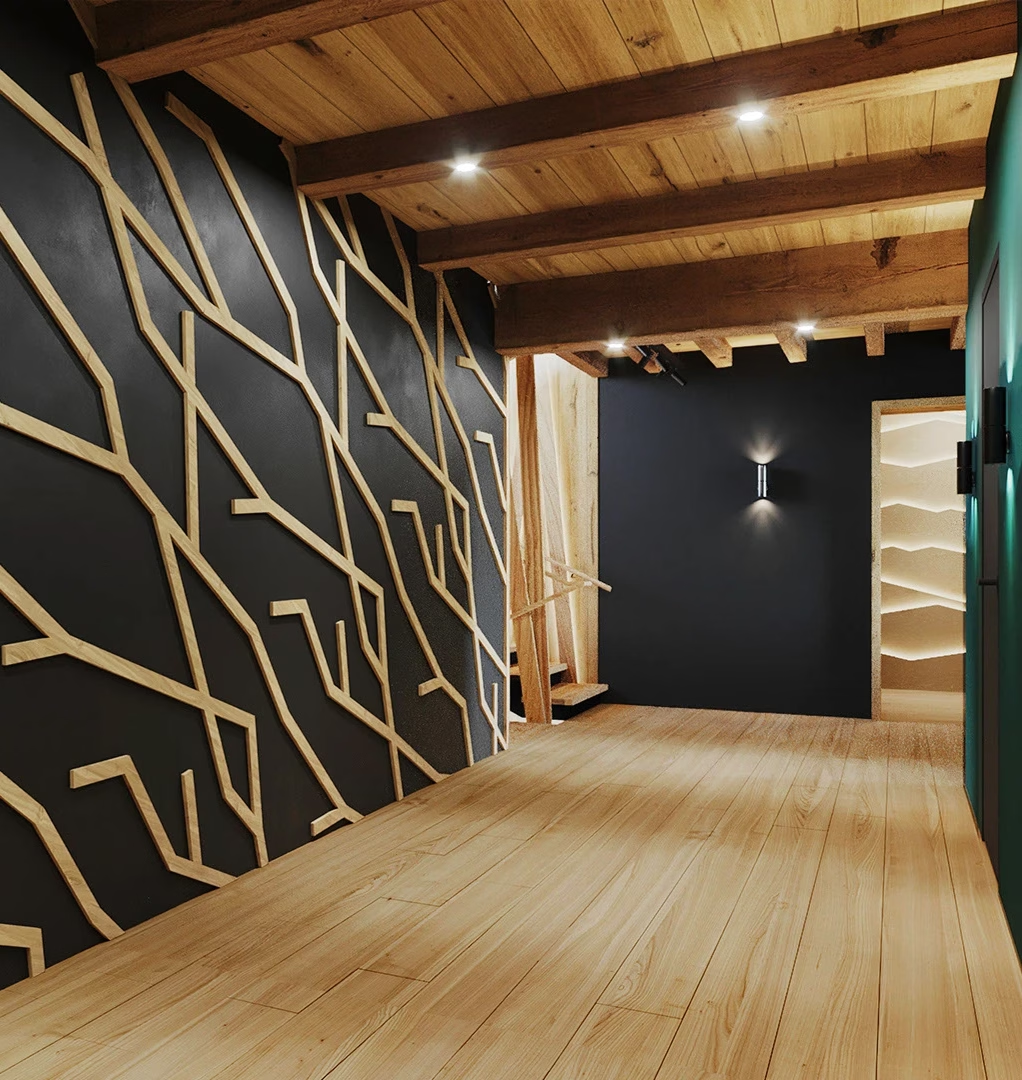
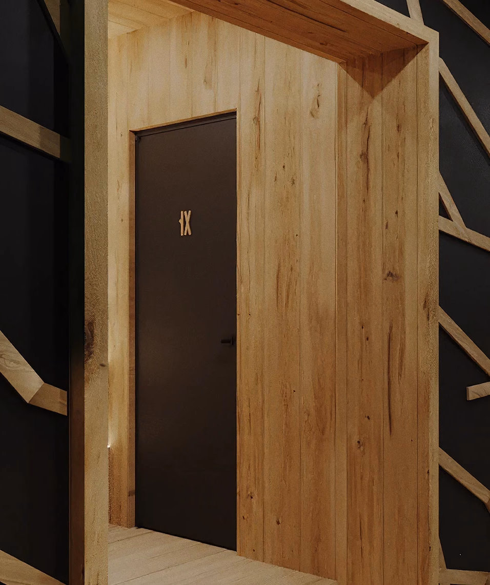
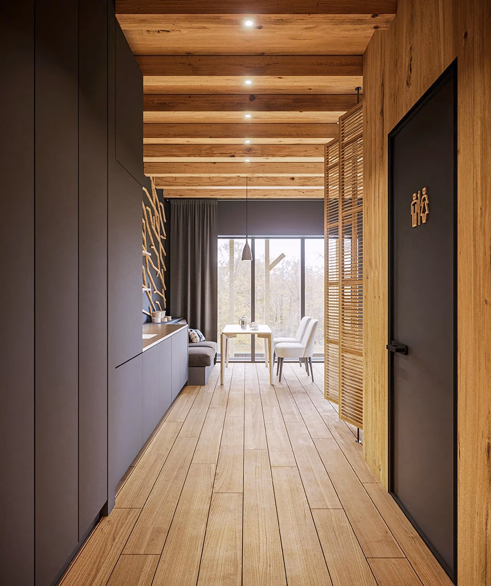
The look and the feel of the building transmit the concept and core ideaof the Hide Hotel. It looks like the building is growing out from thewoods around and resembles a shelter to those who are in search ofpeace and tranquility.
%20(1).gif)


.gif)

.avif)
