
ABOUT
Client: Fast-food restaurant of a new generation. Kitchen is focused on simple and original food from local, seasonal ingredients.
Challenge: The task was complex: in addition to the name, logo and corporate identity we had to develop an interior design.
We focused on a close-knit team working with the architect Anna Domovesova. We started at the same time, analyzing, checking and adjusting to each other’s steps and global course in general. This approach gave us an opportunity to get an integral product, where all details sustain and complement each other.
LOGO
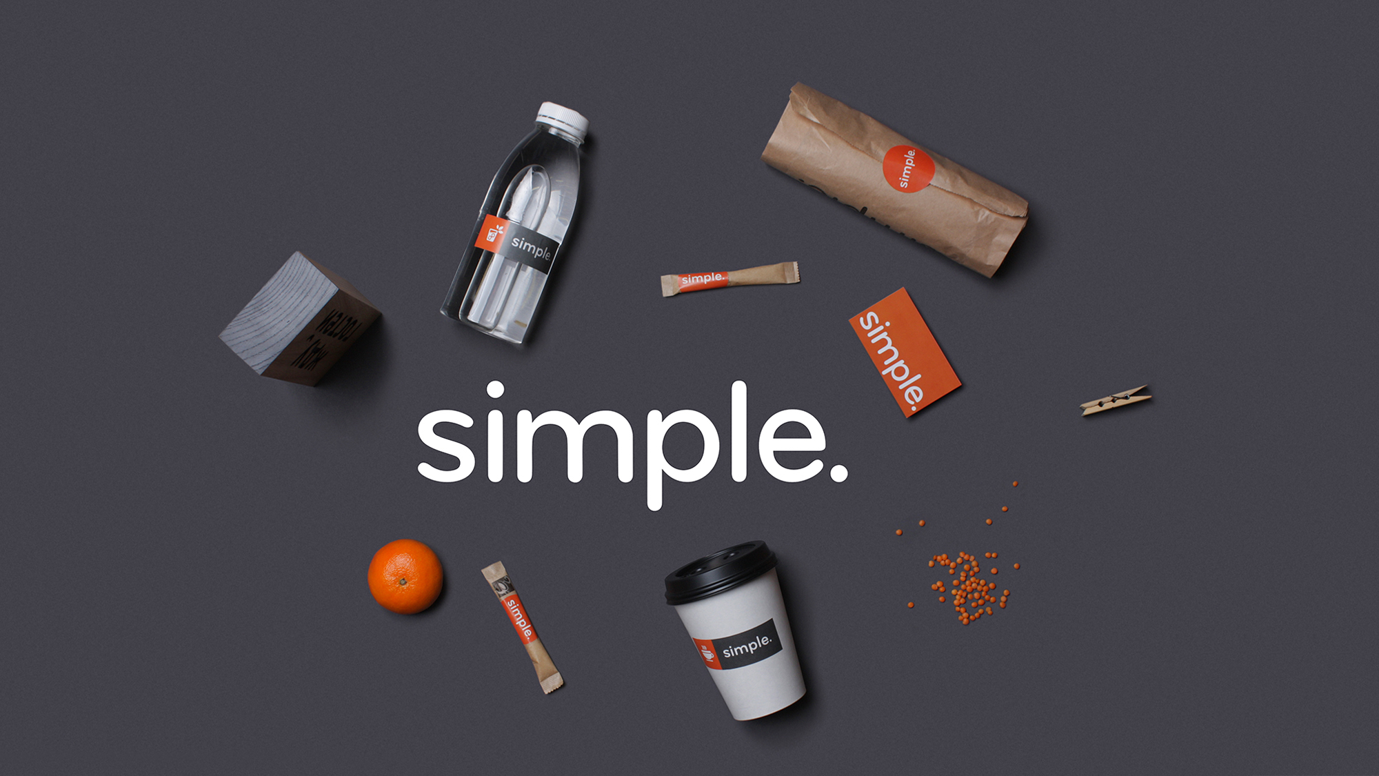
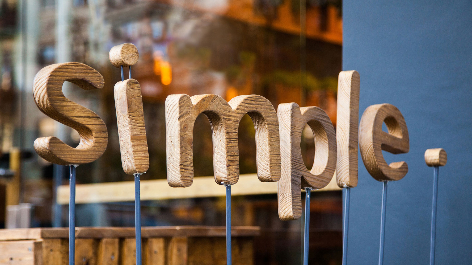
The name of the restaurant had to express its spirit and to be up-to-date: it was important not to get into farm and vegetarian themes. After sereral variations, the name “simple.” was approved. The power of this name is in its simplicity which is supported by the attitude of a friendly brand with a human face and communications.
GUIDELINE
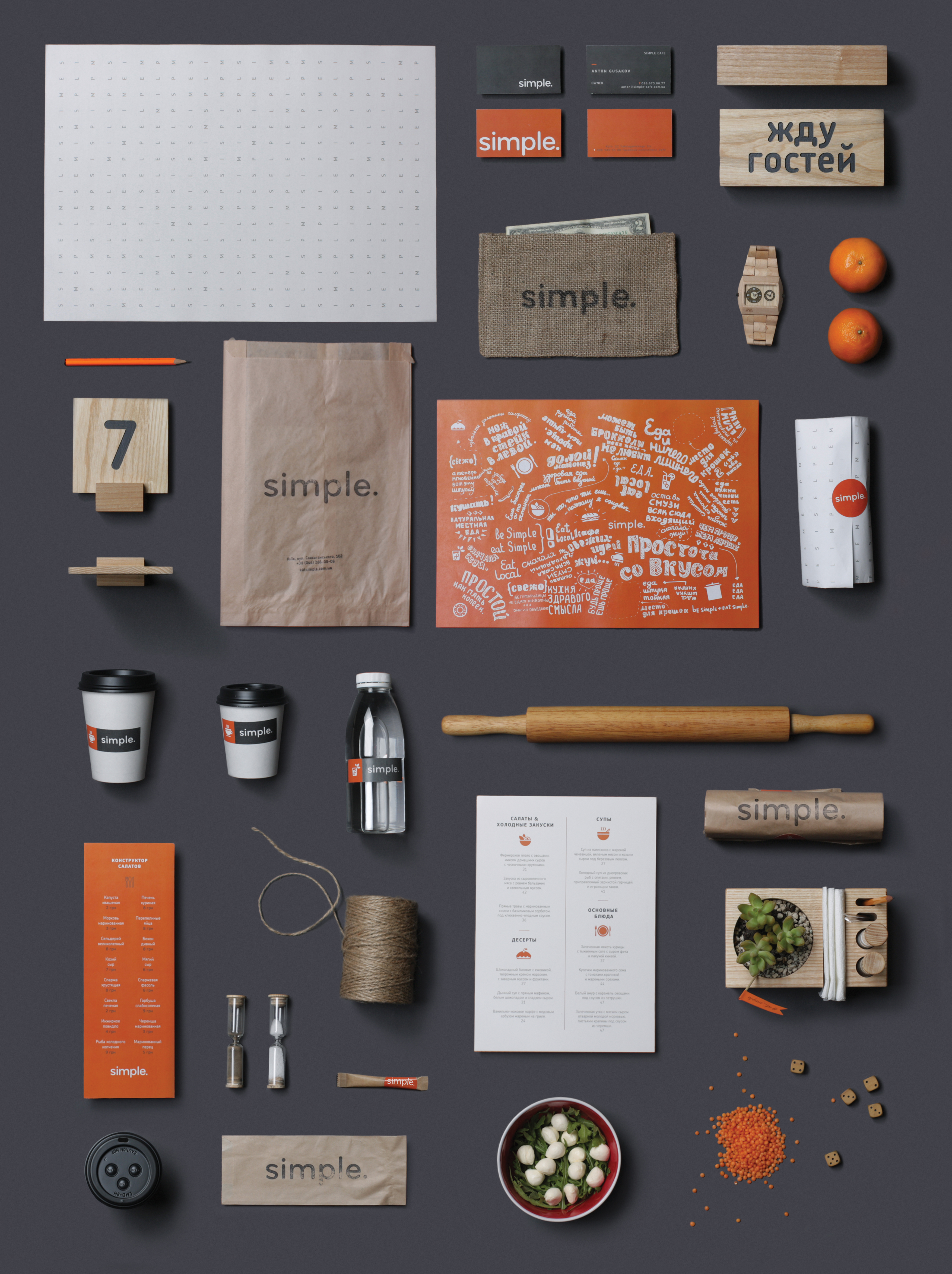
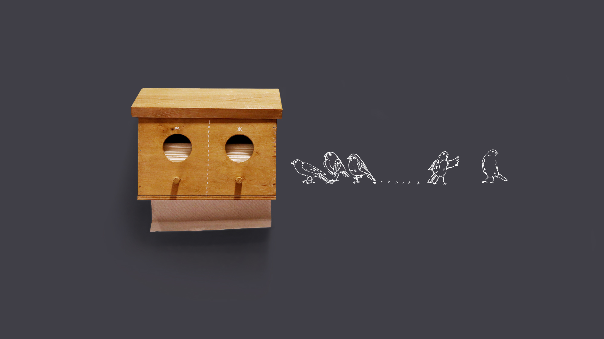
There was a thick guideline developed for Simple restaurant. It includes not just common standards for logo, colors, fonts and pattern application, but many more. We developed few sets of icons, illustrations, the detailed describtion on communication usage, game sets, stickers, few types of menu and many more.
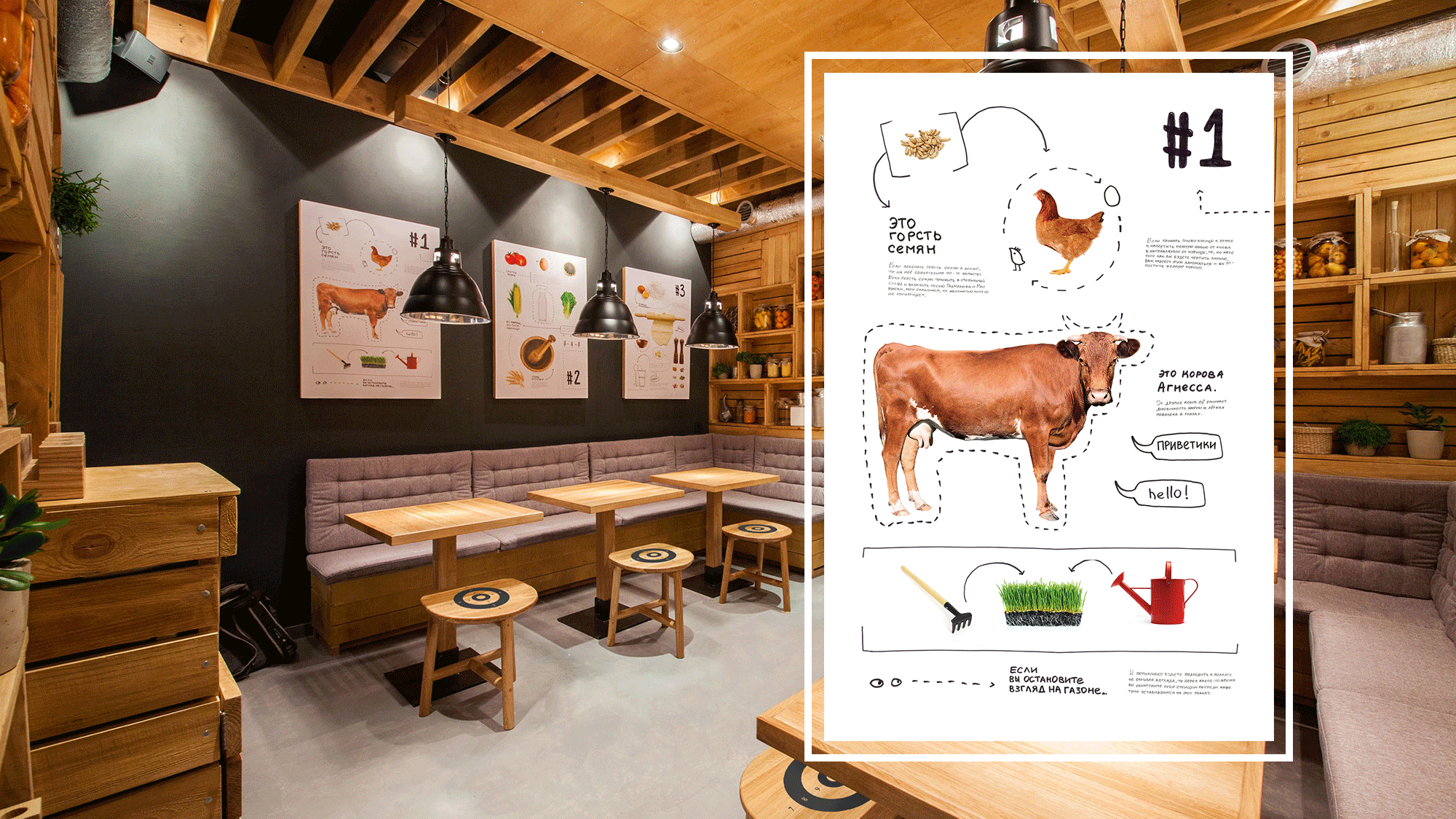
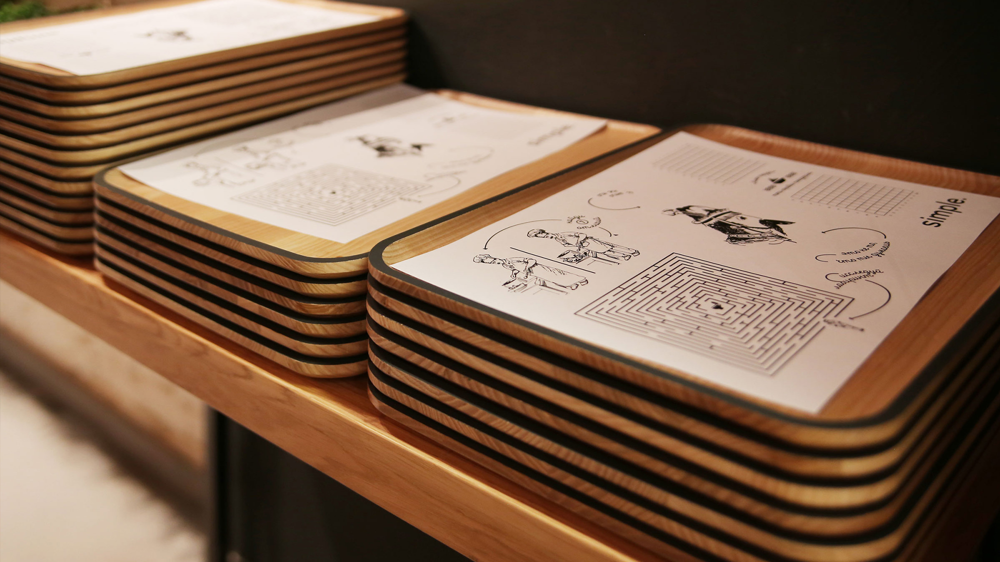
POSTERS
Posters are the food for guest’s eyes – the subject of study and interaction. We decided to tell a great story that goes as a cross-cutting theme through all posters. Its a story about how something simple turns complex, it focuses on the main idea of the restaurant: making interesting and tasty dishes out of basic/local products.
Each poster is supported by a detailed commentary that can tell you, for example, about languorous cow Agnessa, or how to make dough that will speak.
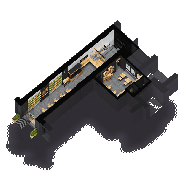
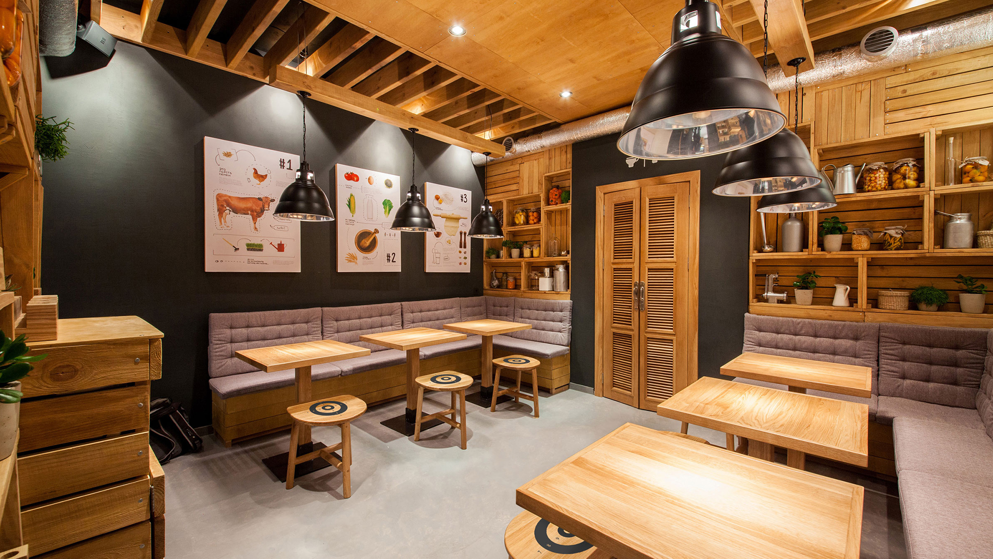
FIRST HALL
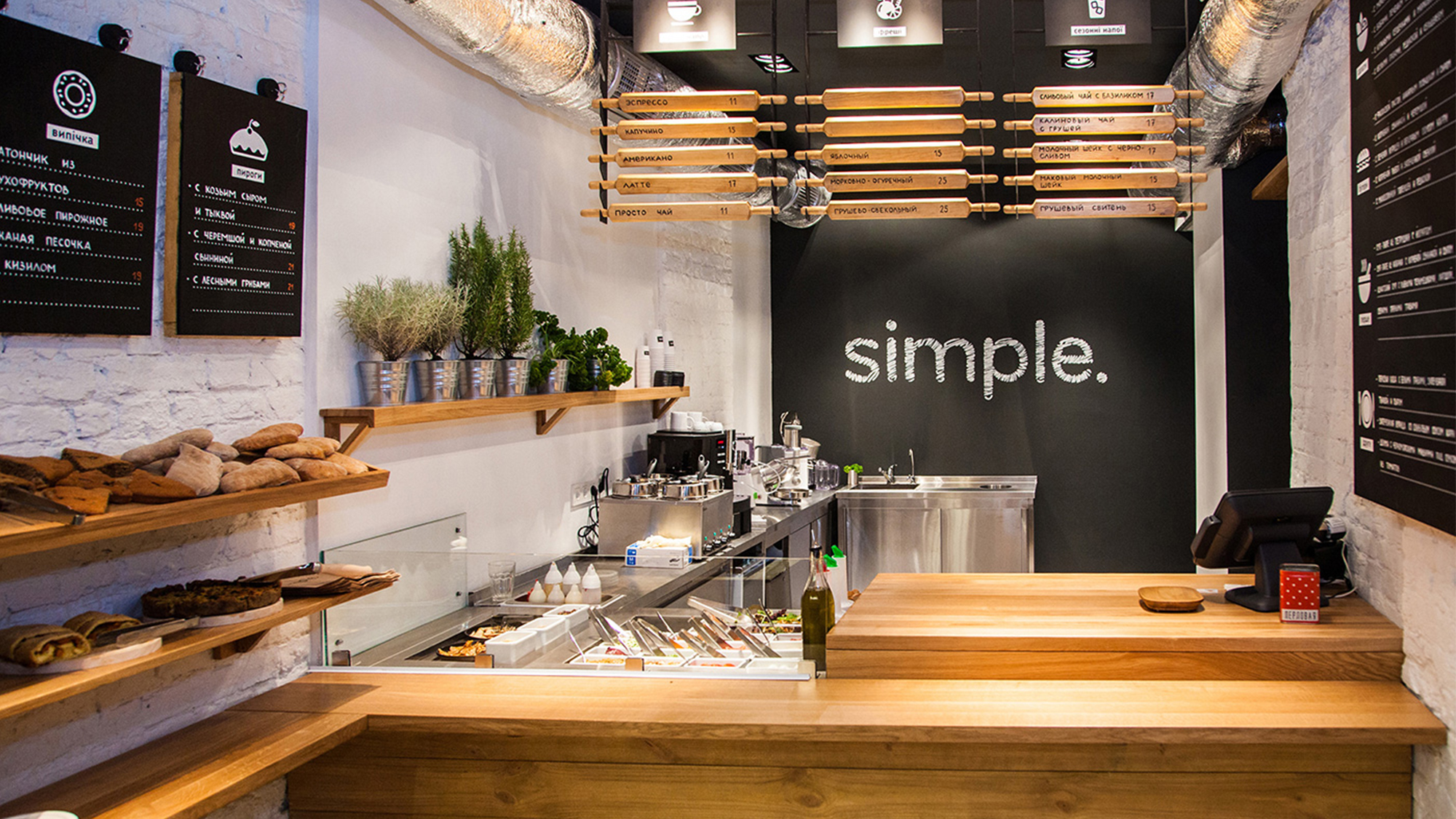
CASHOUT AREA
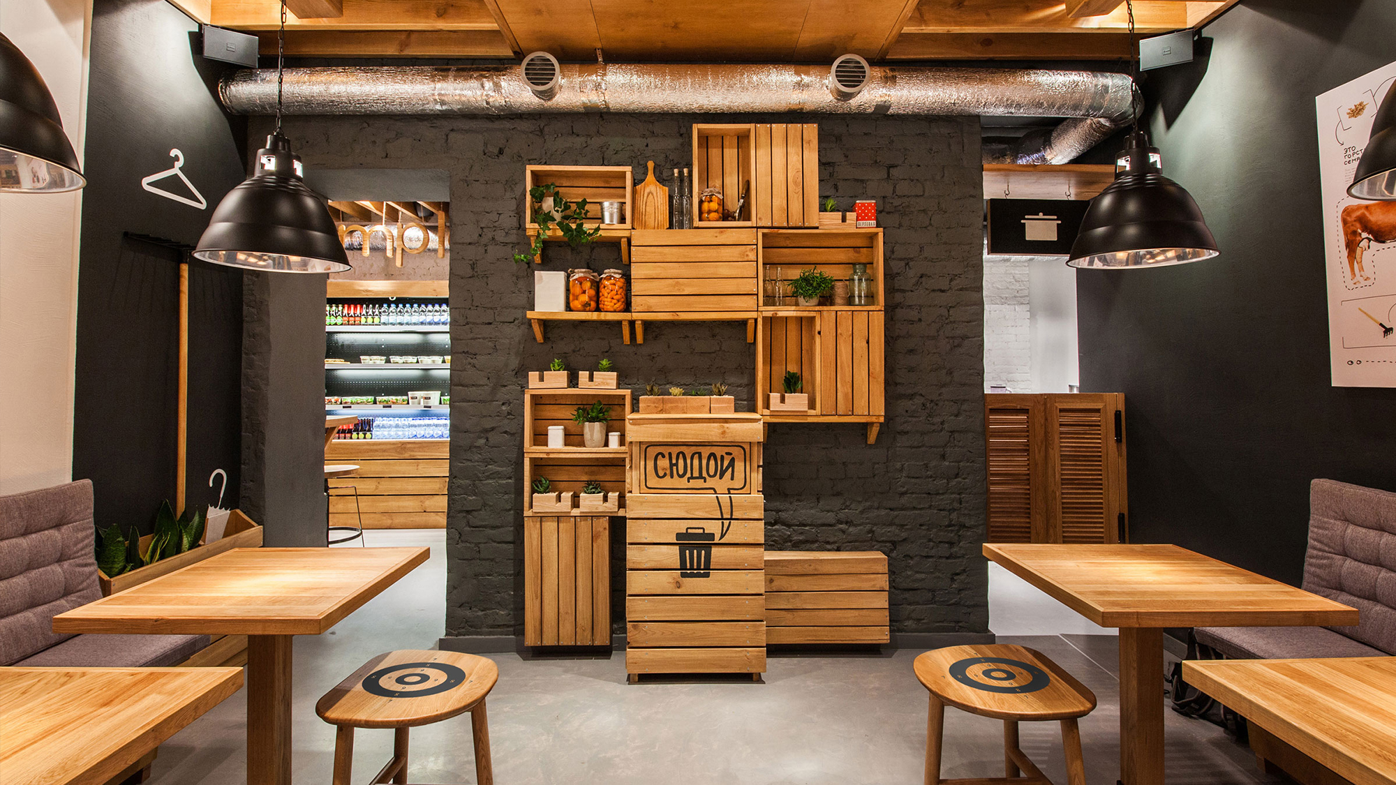
SECOND HALL
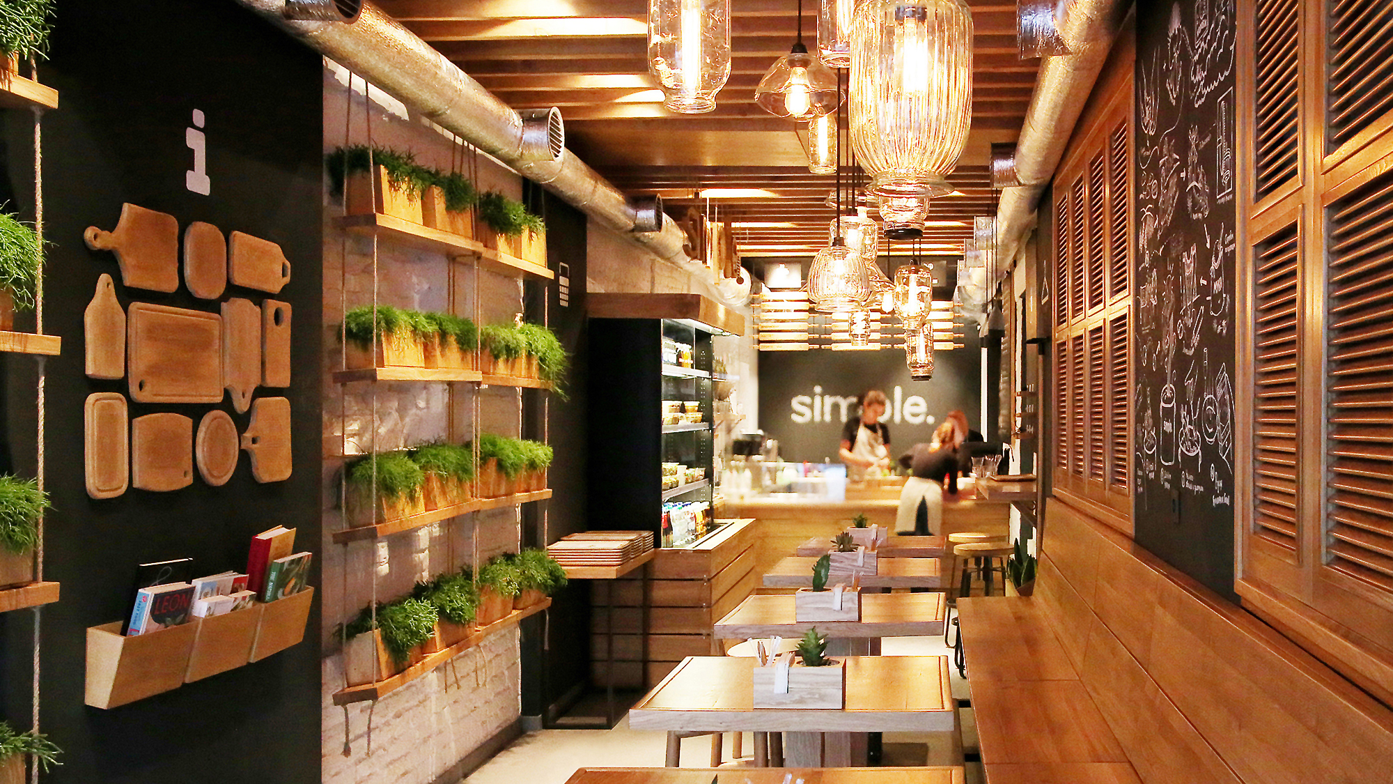
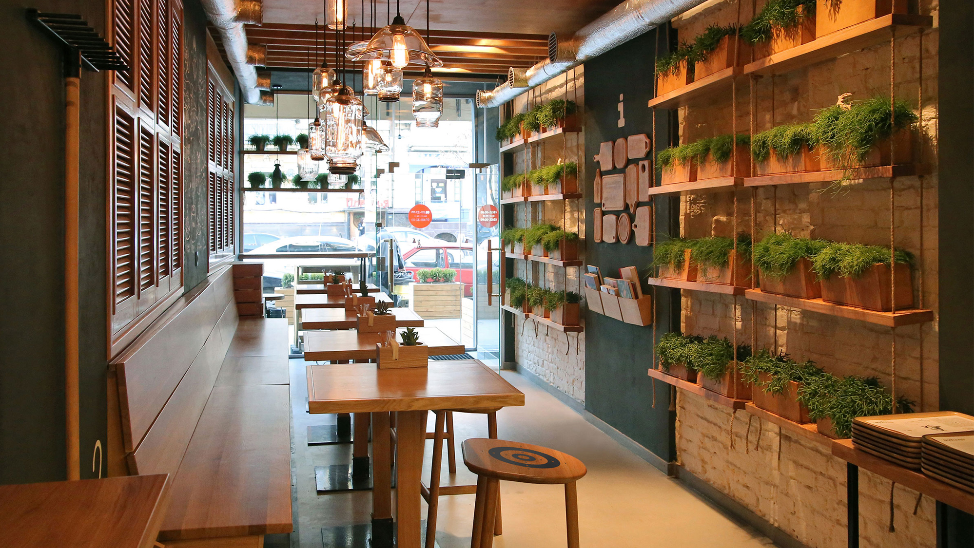
DETAILS
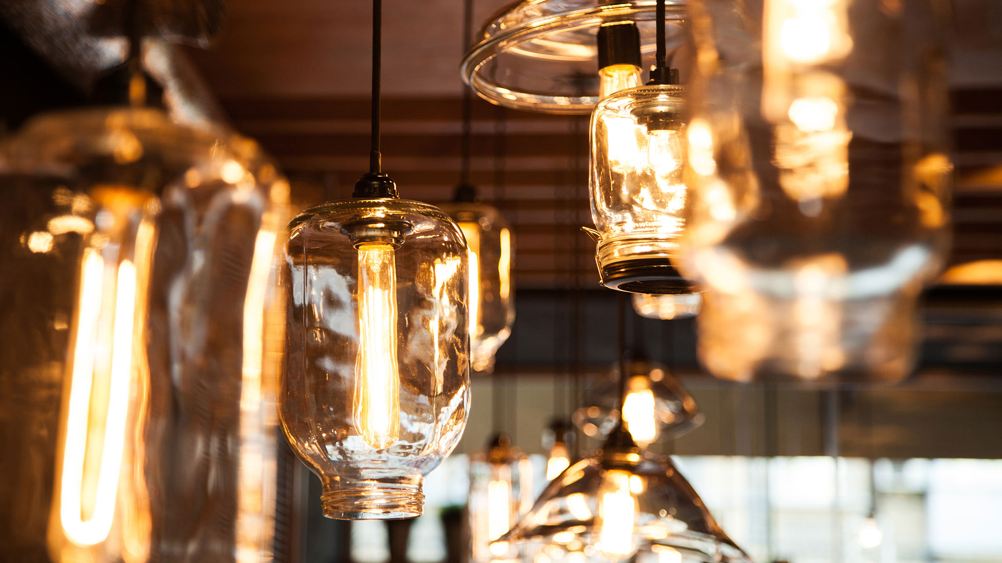
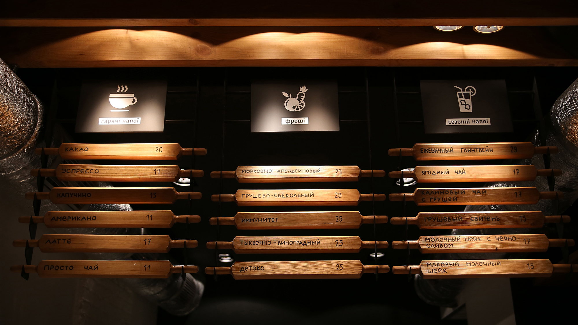
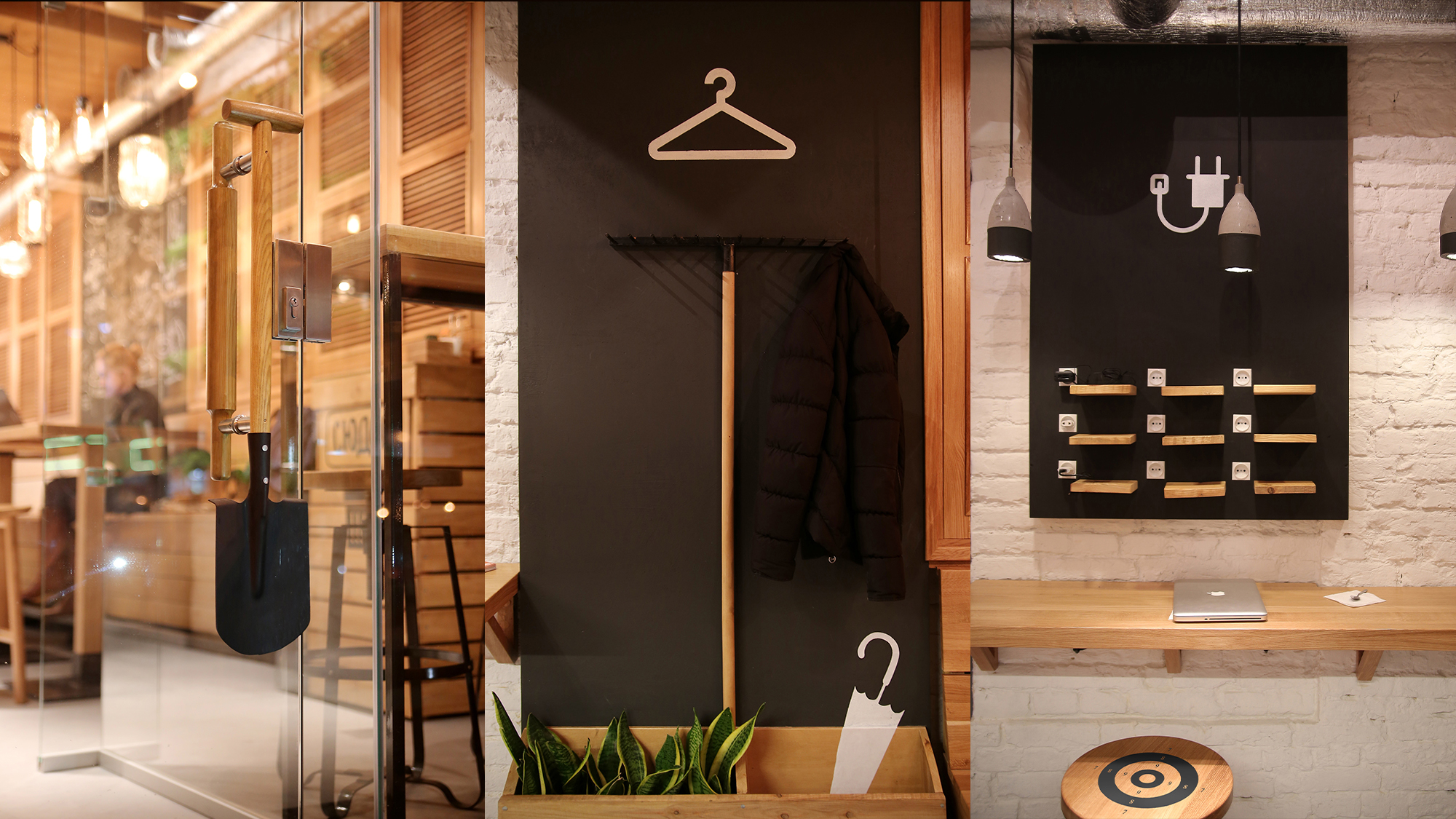
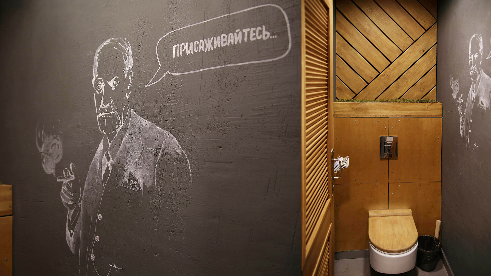
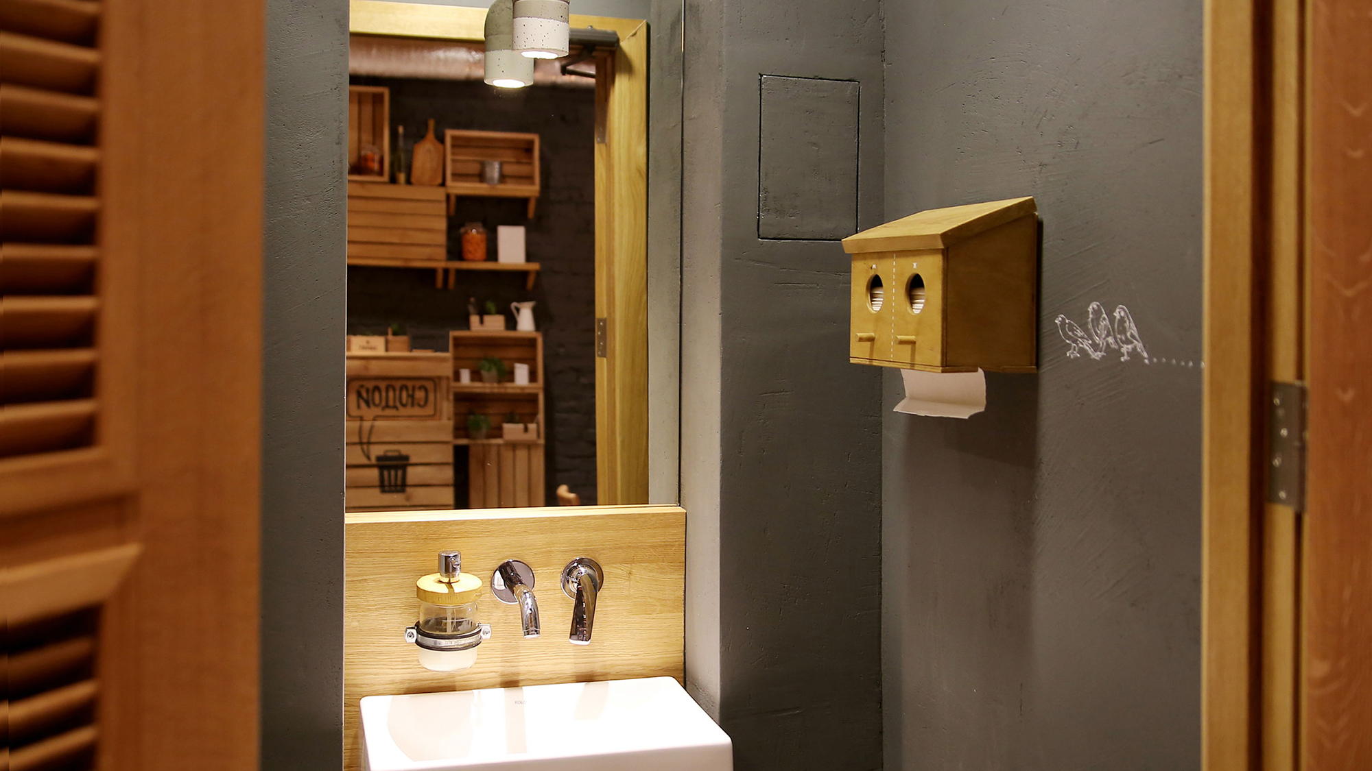
The idea of the restaurant is “be simple, eat simple”, it implies cooking from local, fresh, not preserved products, but in unusual combinations. For this reason we used natural colors and simple materials like wood, plywood, craft paper, etc. without complicated refinement. We also decided to look at usual details from a different point of view. That’s how we got a shovel as a door-handle, rakes as coat hooks, rolling pins as a menu for drinks, concrete lamps made of recycled plastic bottles and so on. We honestly bought all that at the market and adjusted in the interior 🙂
The menu made of rolling
pins and a door handle made of shovel.
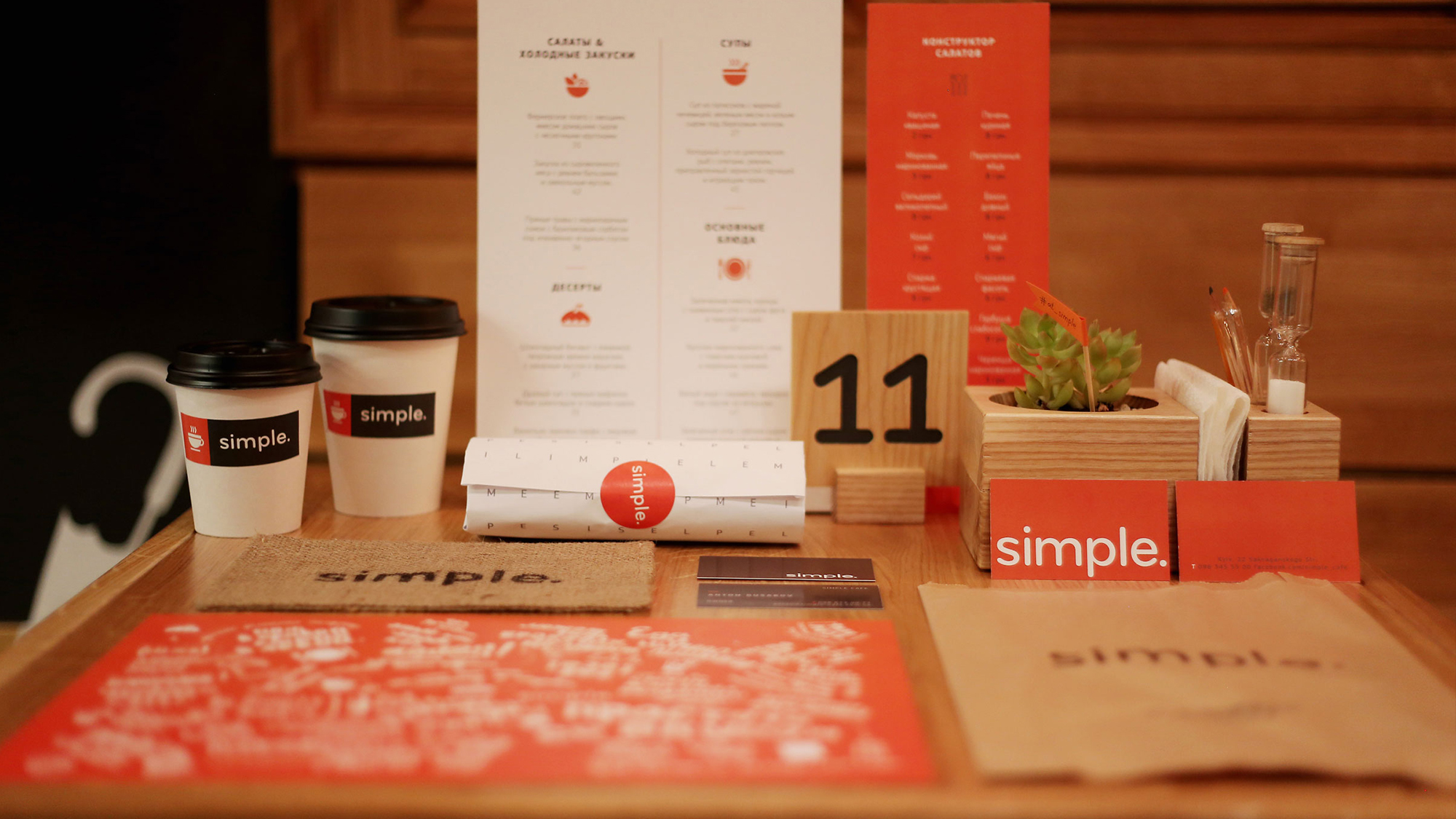
Some identity shot in a restaurant.
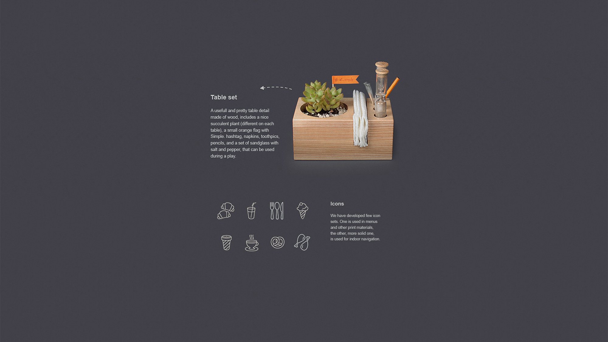
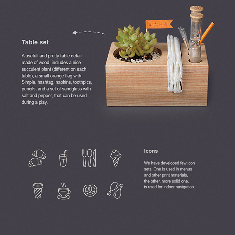
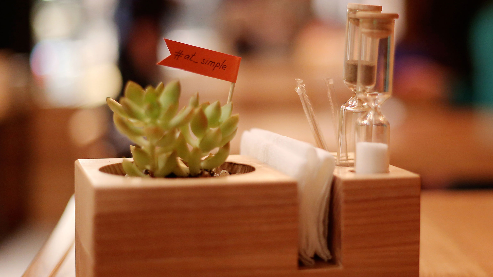
Few sets of table games.
WC
Well, as you see, we did enjoy working on this project. Hope you enjoyed watching it 🙂 Thanks for your attention!
Restaurant address
Saksaganskogo 102, Kiev, Ukraine
Awards
Interior of the year 2014 – silver
InterYear 2015 – bronze
ADC*UA Awards 2014 – bronze
Ukrainian design: the very best of 2015 / E-1. Interior design / The very best of
Please note: the original post of Simple restaurant project was changed due to the discovered fact that on a stage of embodying our project into real life the purchased chairs turned out to be replicas of Mattiazzi’s Radice model. As we respect the rights of the original chair’s designer and the brand that produces those, we made a replacement of all photos that showed them.
PROJECT
TEAM
Anna Domovesova – interior design
Boris Alexandrov – creative director
Dimitry Panasjuk – copywriter
Pavel Panfilov – account manager
Alexandr Osipenko – illustrator
Olga Novikova – designer, illustrator
Elena Parhisenko – designer
Anton Storozhev – designer
Nikolay Mihov – visualization
Photographers:
Andrey Shalimov
Yana Korobenko