A deli restaurant that celebrates the diversity of Manhattan.

.avif)
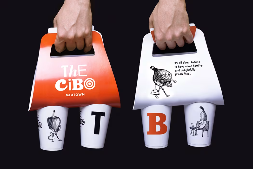
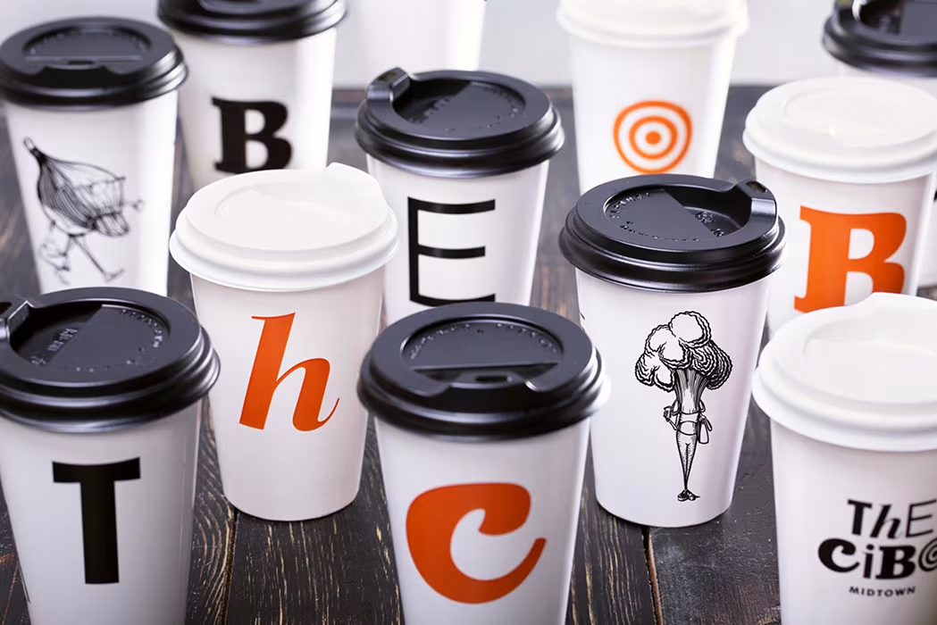
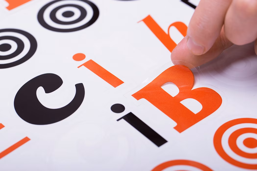
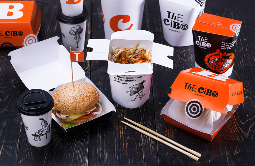
We created a logotype with letters of different moods, developed a custom font, and designed a visual style that communicates diversity. A key feature became a set of anthropomorphic food characters representing typical New Yorkers — they became the "voice" of the brand, adding humor and personality to the space. Everything — from interior elements to packaging — was crafted to build a connection with the visitor and make the Cibo brand vivid, memorable, and friendly.
We had to develop brand identity, interior and exterior design, taking into consideration not only its specialization, but also the location in the busiest part of New York — Midtown, Manhattan.
Challenge: We had to develop brand identity, interior and exterior design, taking into consideration not only its specialization, but also the location in the busiest part of New York — Midtown, Manhattan.
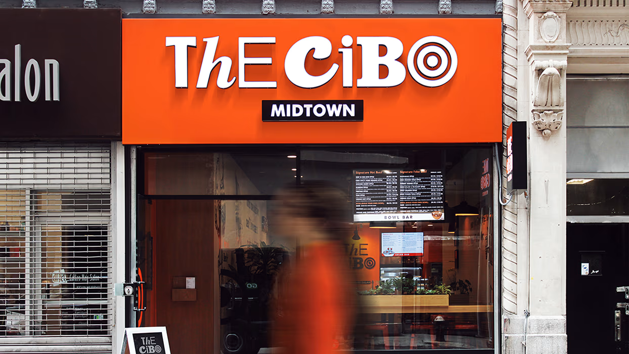
The most important advantage of the restaurant is its extensive and at the same time healthy menu. It serves multicultural cuisine from around the world to suit every taste: from a selection of breakfasts and oriental dishes to an impressive variety of American and Mexican meals.While working on the concept we had to keep in mind the restaurant’s location – Midtown, Manhattan, NYC. The area is very busy and has dynamic rhythm of life, with an intensive flow of visitors and numerous competitors offering a range of fast food options. Our task was to transmit the idea of diversity through simple and comprehensible style. We also wanted to keep the mood of the brand emotional and communicative.
.avif)
.avif)
%20(1).gif)
.avif)
.avif)
%20(1).gif)
AND INTERIOR DESIGN
The logotype illustrates Cibo’s diverse menu, and the variety of its customers – it is a font composition that contains letters with different characters and mood, but at the same time forms an integral and unique composition. We’ve extended this feature to corporate style and created a custom font, that can be used for corporate headlines or advertisement copy. We’ve also developed a series of illustrations with funny characters in the form of anthropomorphic products that portray typical New Yorkers: the yuppie rushing to his office, the idle hipster, the tourist taking photos of everything on his way, the IT guy hunching over the laptop, totally absorbed, etc. Characters are emotional and vivid — they communicate with each other and guests, speak out their thoughts from the branded items and interior walls. They welcome the visitors and the very next moment they start giving advice and cracking jokes. The overall style of Cibo is set to make an emotional connection with each customer.
.avif)


.avif)

