
ABOUT
Client: The project is inspired by US Government and the Ministry of Agriculture of the Republic of Moldova in the framework of the creation of the «National Bureau of Grapes and Wine» with the purpose of realization of the state policy regarding the wine industry.
Challenge: The Ministry of Agriculture of the Republic of Moldova with help of US Government has announced a tender for the creation of a brand new association of winemakers of Moldova. Participants were required to give their vision of the name, slogan, and logo. After the concept was designed and presented we have won the tender for developing the «Wine of Moldova» brand.
CONCEPT
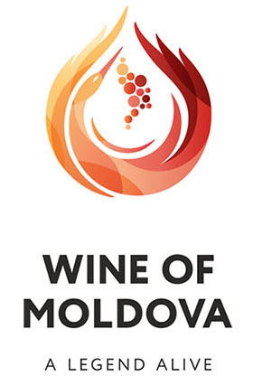
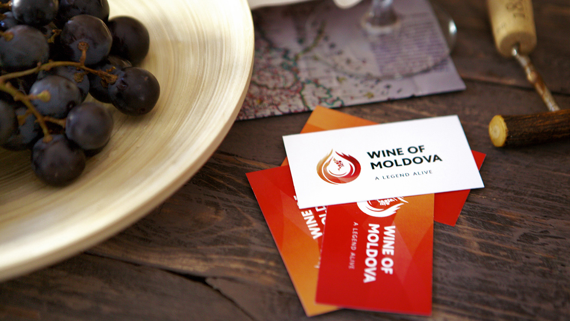
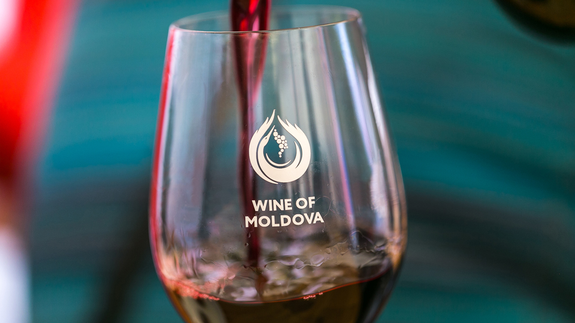
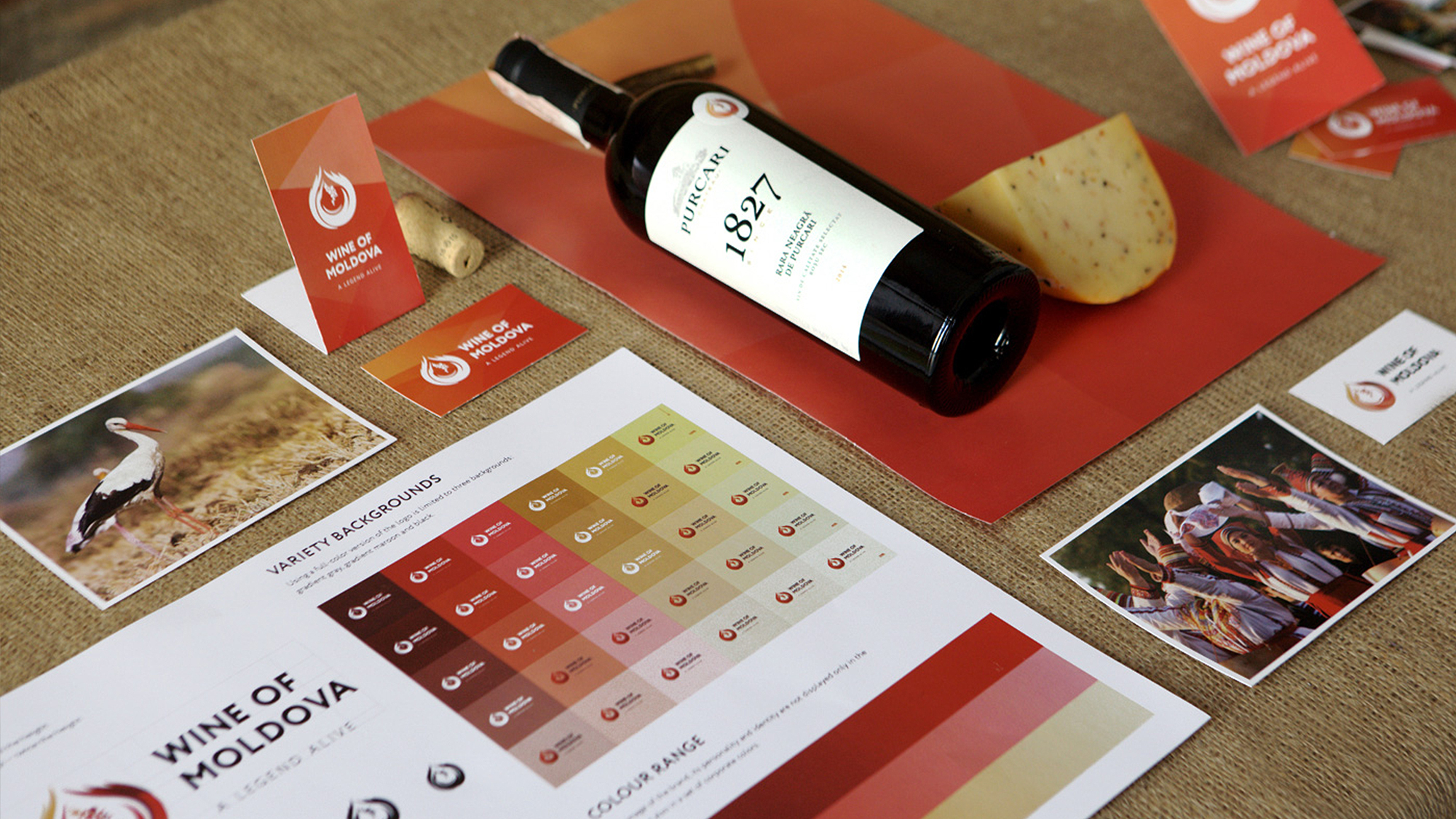
LOGO
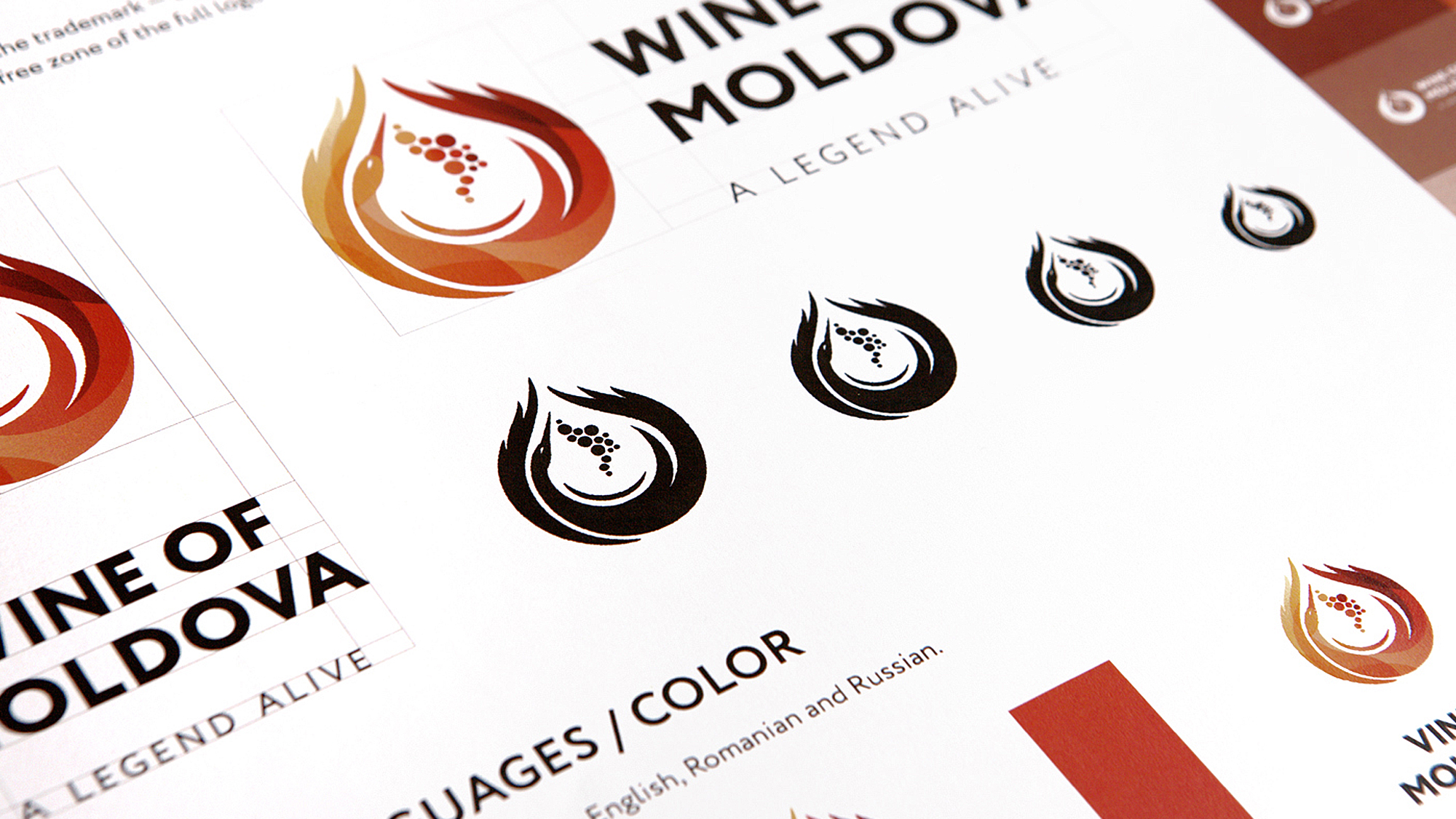
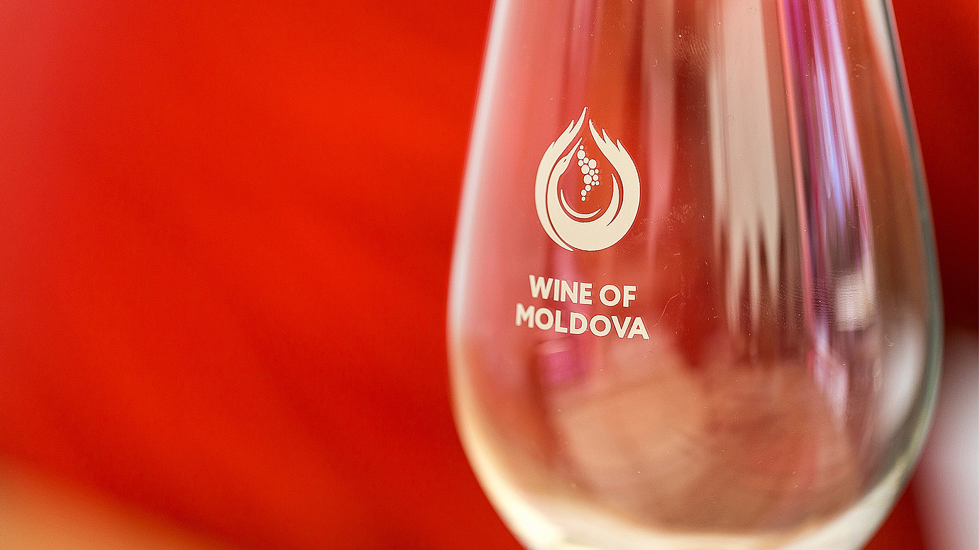
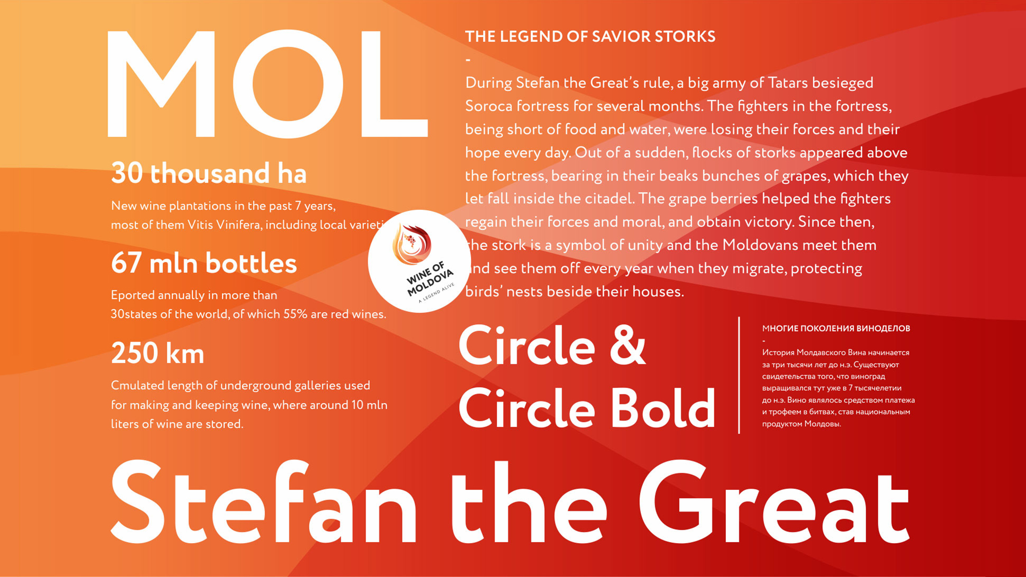
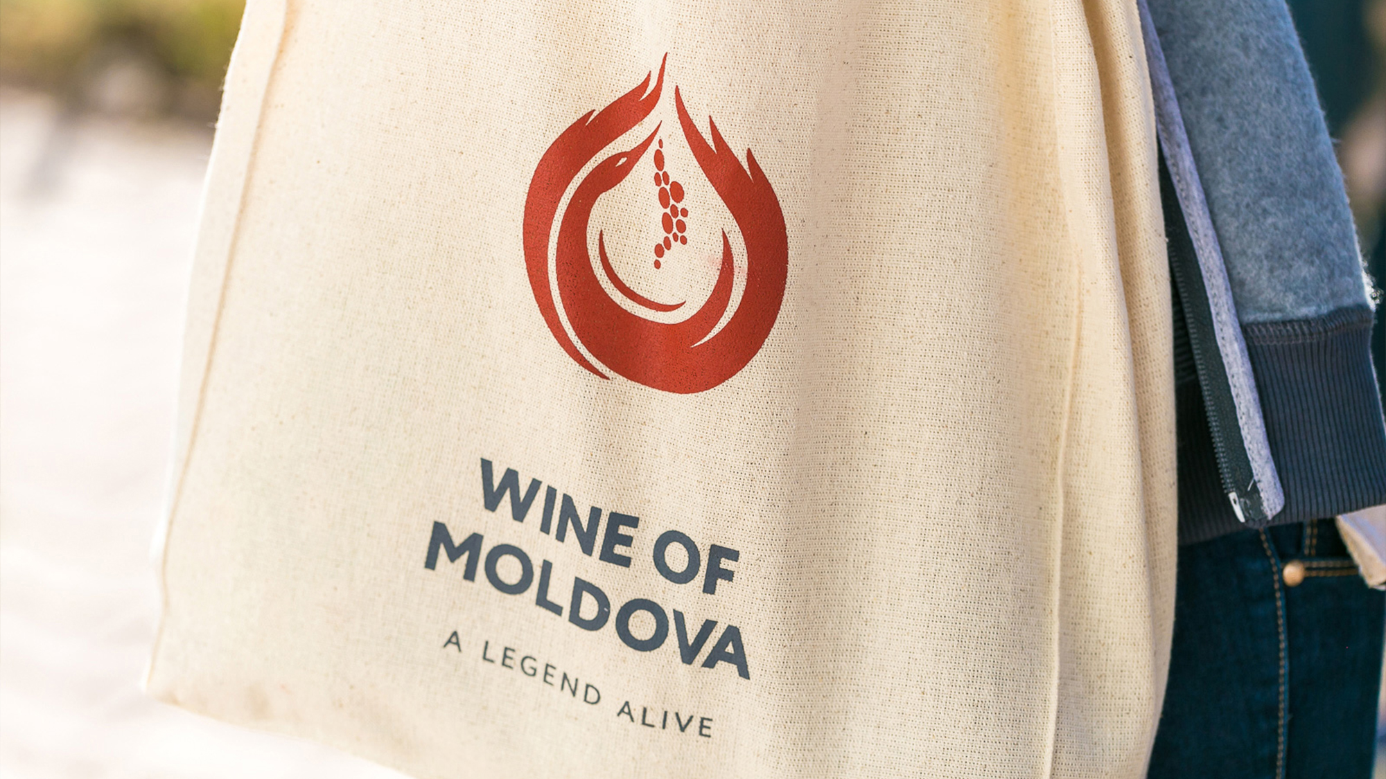
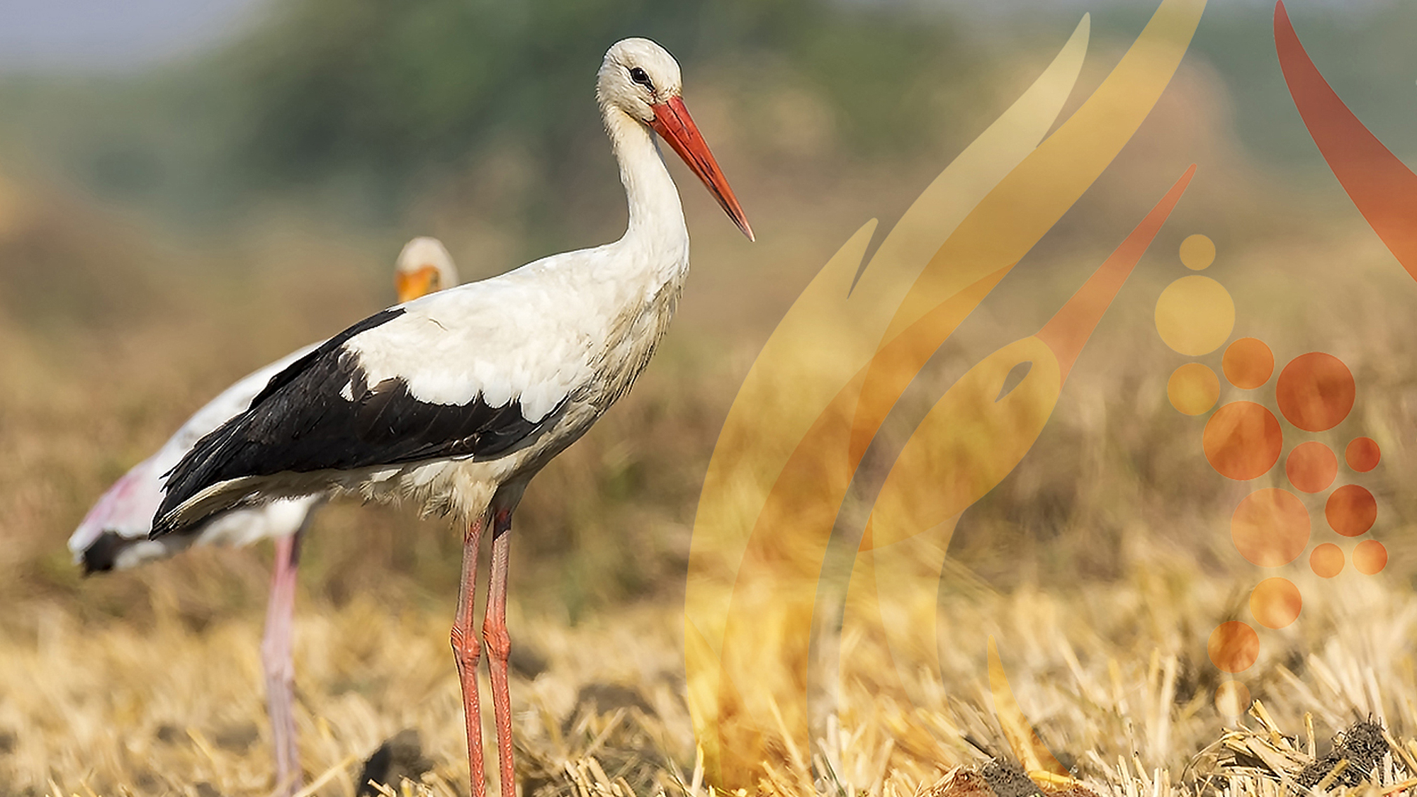
Logo represents a stylized image of a white stork with a bunch of grapes. White stork in this concept is a traditional symbol and a sign of the quality of Moldovan wine growing and winemaking. Aside from the obvious symbol of a stork, there is a number of additional meanings higgen in the sign. For instance, the overall silhouette is designed in a shape of a drop of wine, wings make up the image of flames, and the bunch of grapes follows the contours of Moldova on the world map ultimately. Thus, the brand name is a combination of four elements. The grapes represent a symbol of the earth, stork is a symbol of the air, wings became the fire, and a drop of wine symbolizes water..
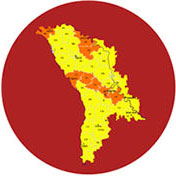
Shape of Moldova
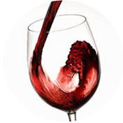
Wine dynamics
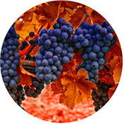
Grapes
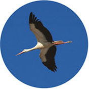
Stork
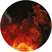
Fire

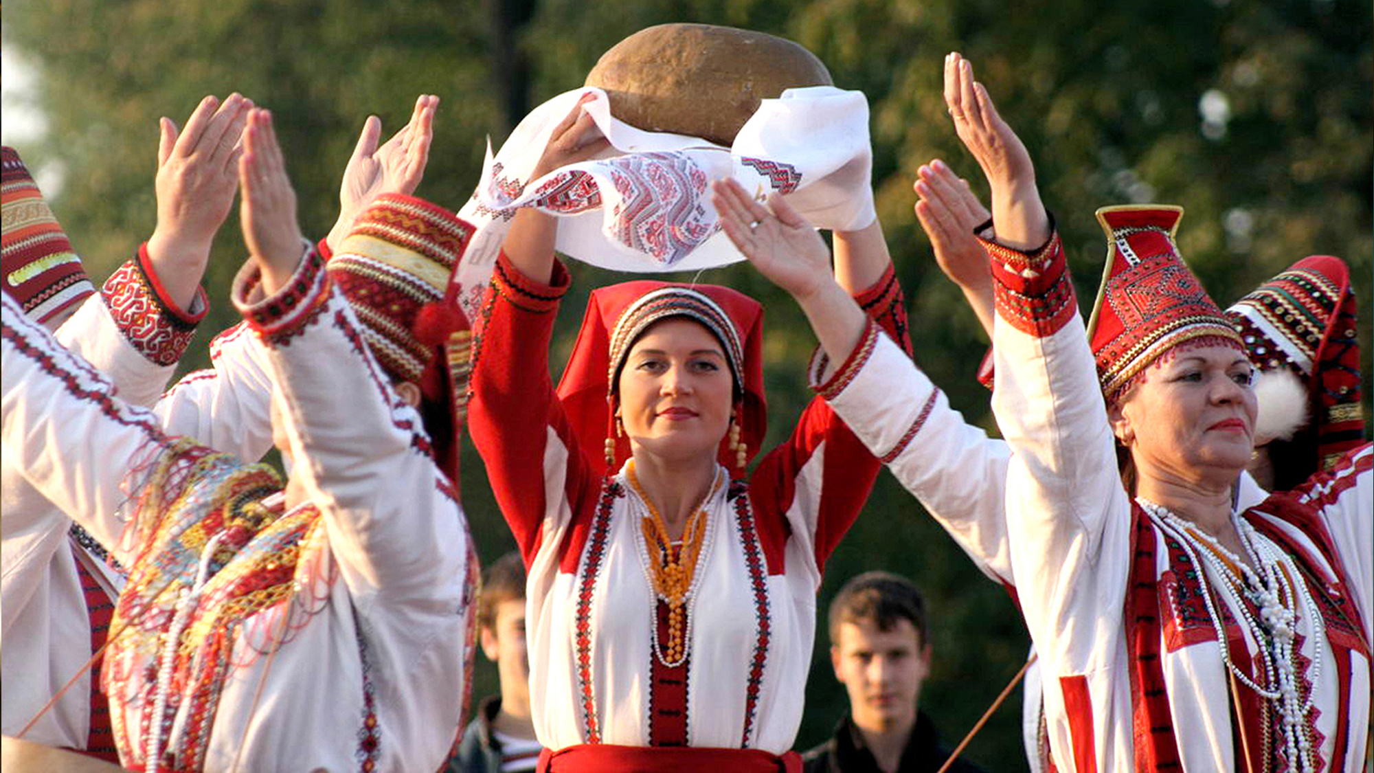
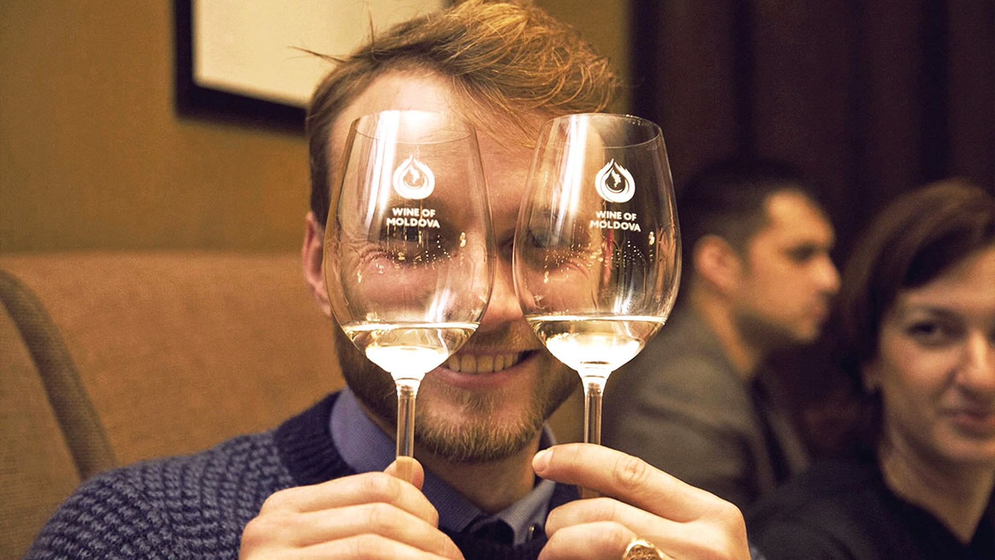
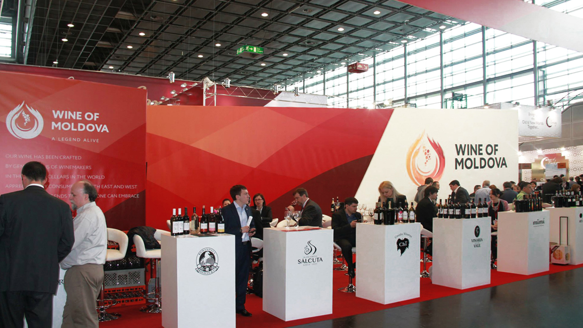
Original music is used by Zdob și Zdub – White wine/Red wine Particular photos from Wine of Moldova facebook page
Restaurant address
Saksaganskogo 102, Kiev, Ukraine
PROJECT
TEAM
Boris Alexandrov – creative director
Anton Storozhev – designer
Elena Parhisenko – designer
Yuriy Domovesov – designer/motion designer
Dimitry Panasiuk – copywriter
Denis Dukov – creative retouch
Alexander Gusarev – post production
Konstantin Kondratenko – post production/font designer
Gregory Vepryk – photographer
Vladimir Shurubura – photographer