A healthy fast-food for Scandinavian countries.

The task was to develop a new fast food restaurant with the open fire and wok pan in the core of the concept. With the first location in Copenhagen and expanding a chain over Denmark, Sweden & Norway. Friendly restaurants with affordable prices and a positive atmosphere where dishes are prepared on the open fire in wok pans and are tailored to customers’ tastes in 3 easy steps.
The name Woobles was inspired by the combination of Wow and Noodles. Yes, it’s that simple. The preparation of food on an open fire is a wow-process that looks like a show and has a wow taste too. You can even feel the joy just from
saying: “Woooobles!”. And actually it also resembles the sound of someone greedily sucking up the last spaghetti — “Wooob!”
.avif)
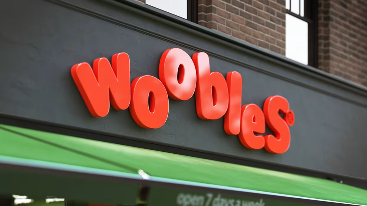
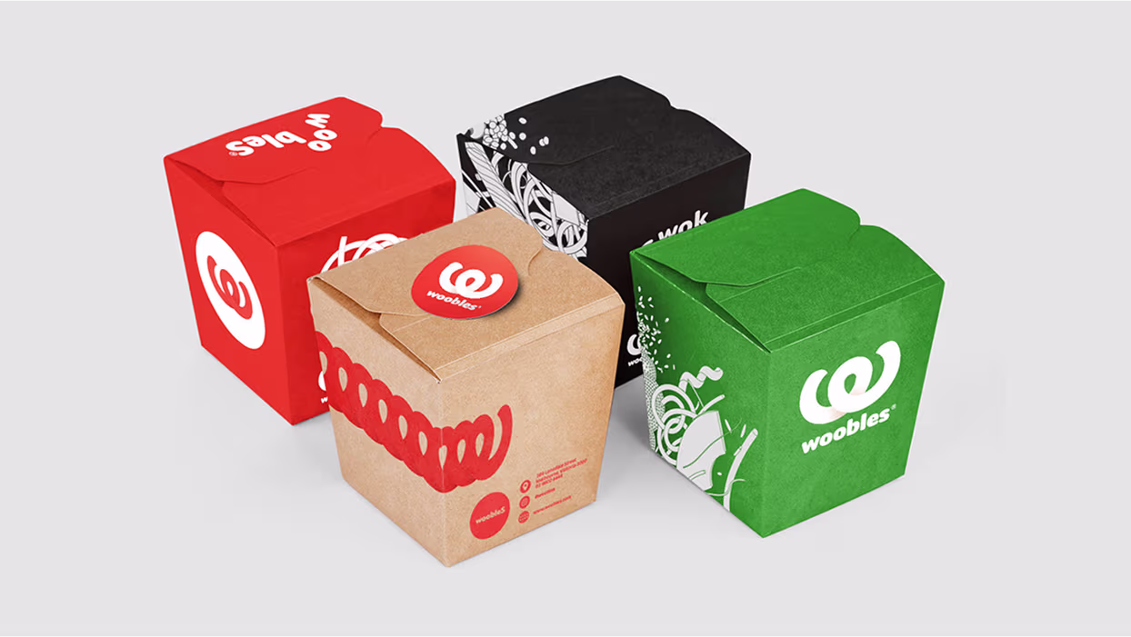
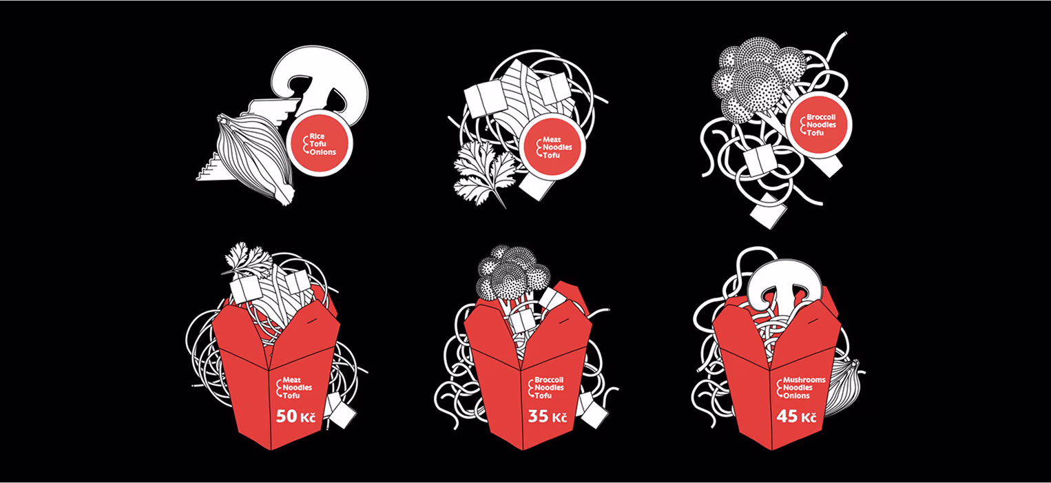
The logo is a noodle-like “W” letter. It can stretch like a loooooong noodle. It can move, jump & act silly.The style is enriched with the dynamic patterns made of illustrated ingredients from Woobles kitchen.
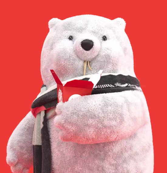
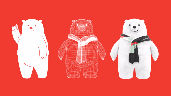
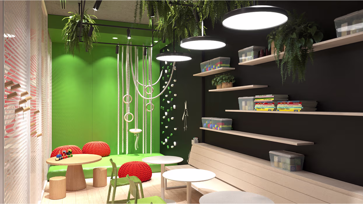
You know...for the kids :)
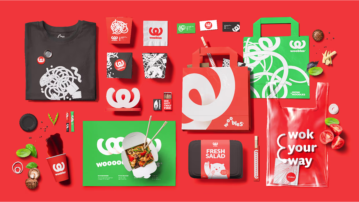
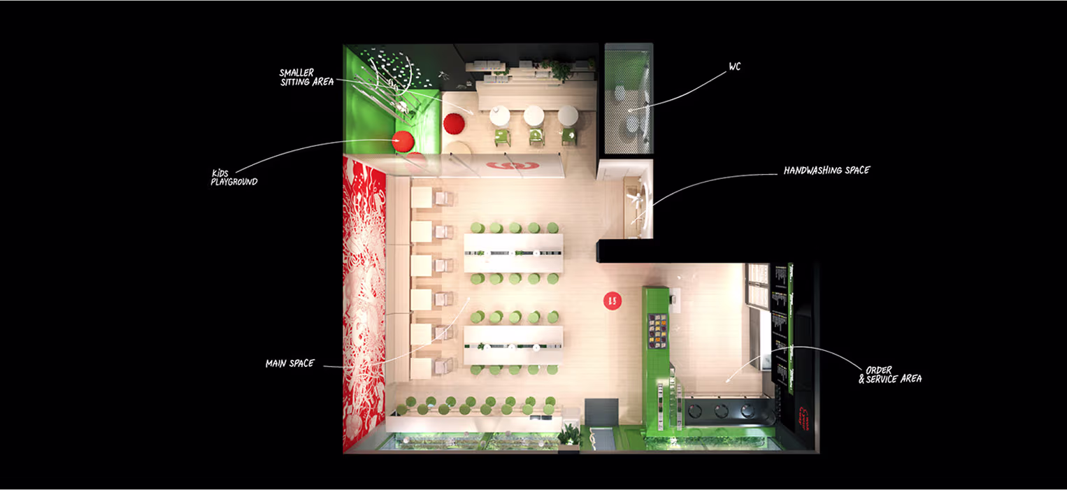
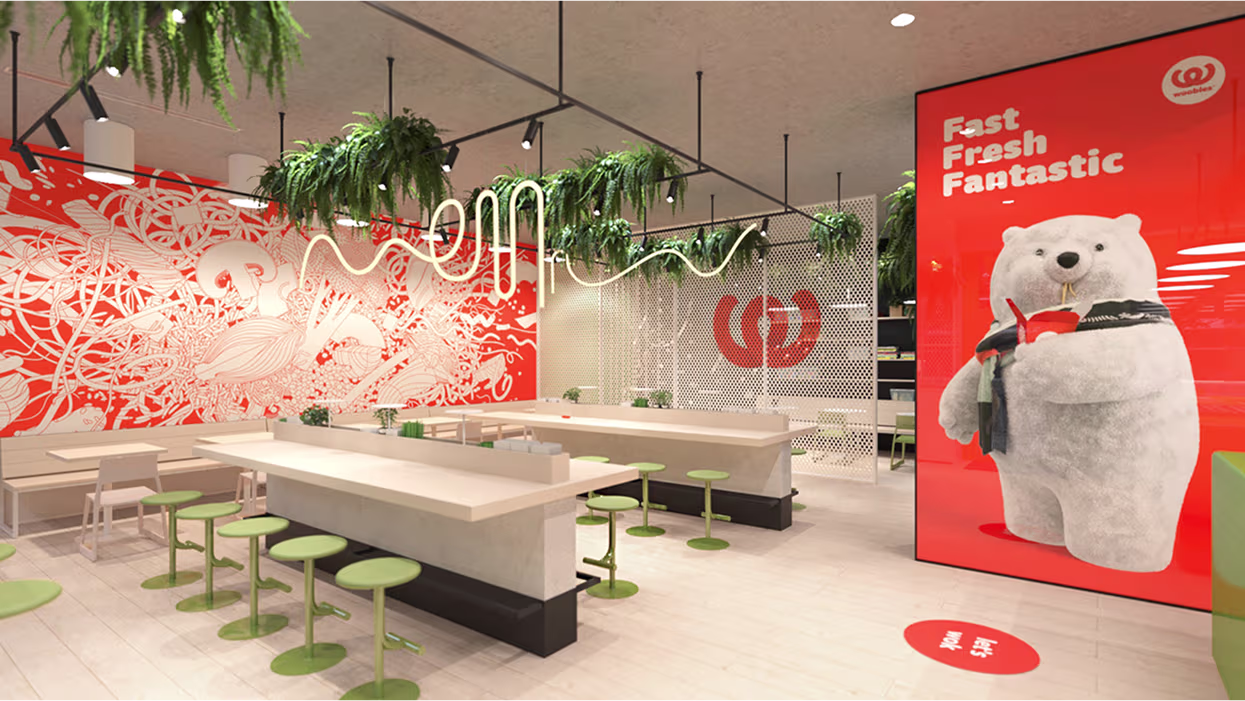
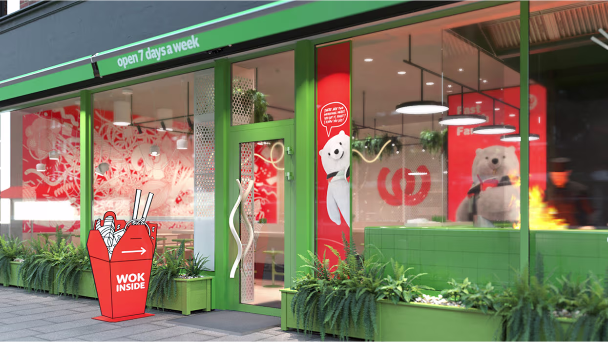
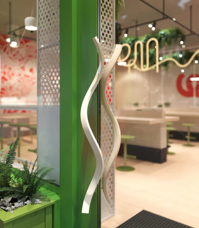
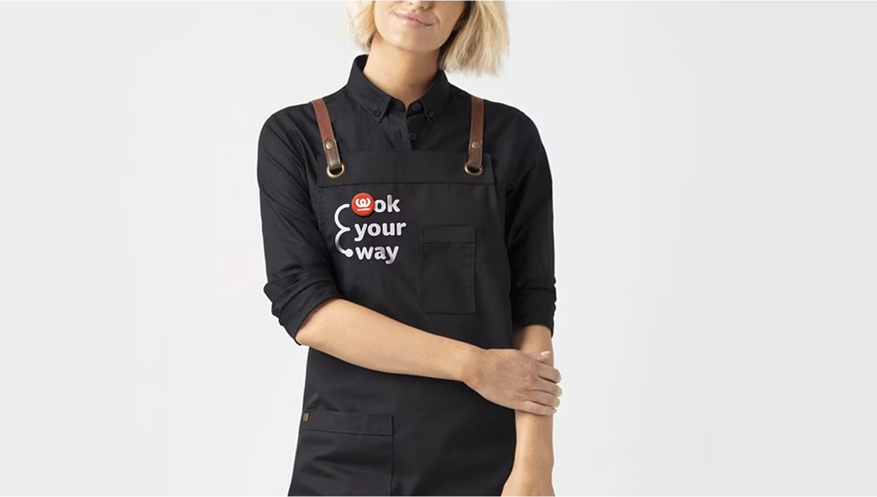
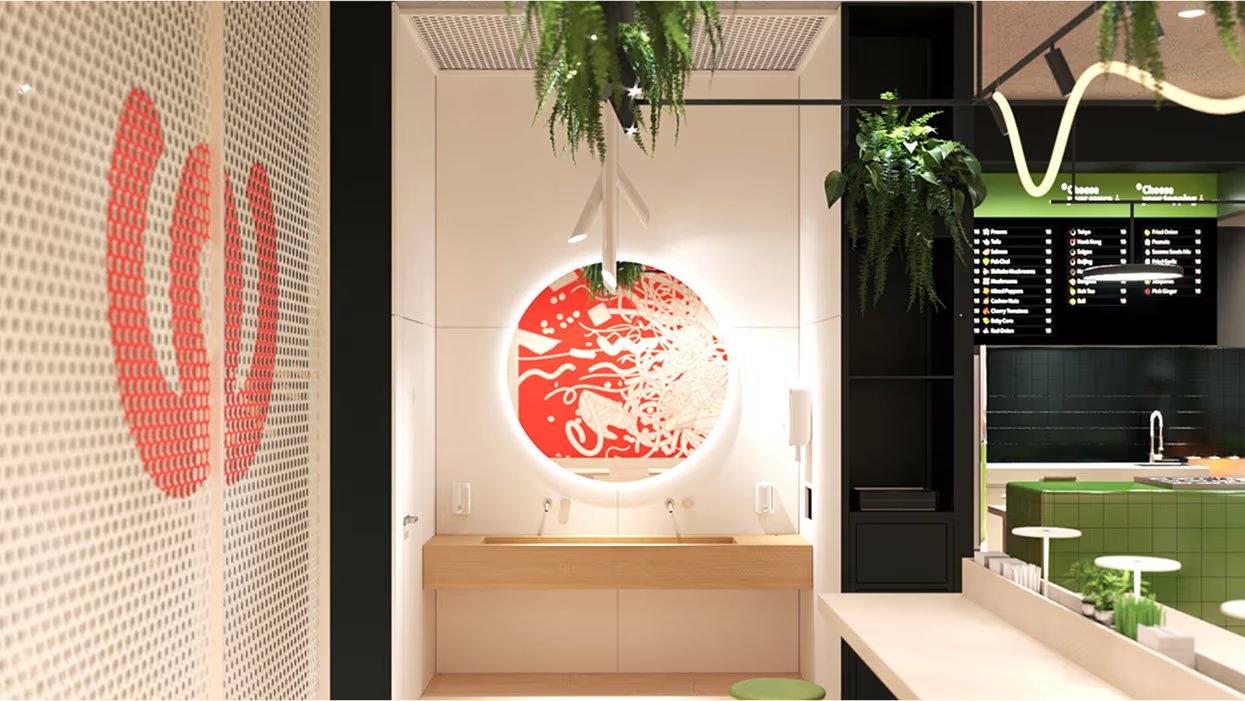
A universal and customizable design solution was developed to make it possible to quickly expand the business to a chain of franchise restaurants, applying the design to any space available for the lease. Brandon Archibald’s unique service “Restaurant Identity™” gave the Woobles operation space its branded look and feel. The brand identity guidelines not only explain how the brand identity should be used but also provides a detailed explanation of interior and exterior design rules and regulations. The colors, materials, furniture, lights, textures, and fixtures were carefully selected and applied to the first location. Now, they can be expanded to any other place within the days saving plenty of time.<
.avif)
.avif)
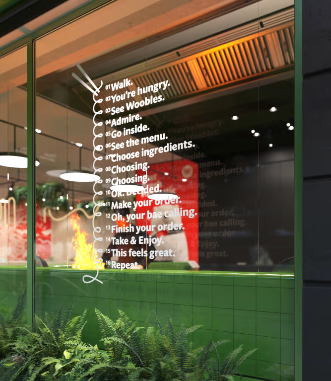
The set of customizable promotional window stickers, various signs, POS materials, and advertising layouts were developed to cover any franchise location’s most common needs.
Sticker gimmick for selfie lovers
There is not much needed to encourage visitors to take wow-noodle-style selfies! Just one mirror and a big WOW sticker. Simple and catchy.
.avif)
.avif)

.avif)
